Block Kit helps deliver more visually appealing content in Slack
Slack has become a critical communications tool for many organizations. One of the things that has driven its rapid success has been the ability to connect to external enterprise apps inside of Slack, giving employees what is essentially a centralized work hub. This ability has led to some unintended consequences around formatting issues, which Slack addressed today with two new tools, Block Kit and Block Kit Builder.
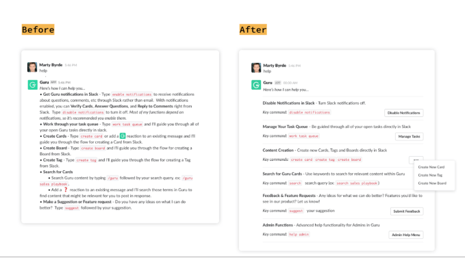
Block Kit lets developers present dense content in a much more visually appealing way, while Block Kit Builder is a prototyping tool for building more attractive apps inside Slack. The idea is to provide a way to deliver content inside of Slack without having to do workarounds to make the content look good.

Before and after applying Block Kit. Screen: Slack
Bear Douglas, who is Slack’s director of developer of relations, says developers have been quite creative up until now when it comes to formatting, but the company has been working to simplify it. Today’s announcement is the culmination of that work.
“Block Kit makes it easier for people to quickly design a customized app in Slack. We’ve launched a no-code builder that will let people design the messages that they show inside Slack,” she explained.
She said that while this tool is really designed for people with some programming or Slack admin-level knowledge, the ultimate goal is to make it easy enough for non-technical end users to build apps in Slack, something that is on the road map. What enhancing these tools does, however, is show people just what is possible inside of Slack.
“When people see Block Kit in action, it is illuminating about what can be done, and it helps them understand that it doesn’t just need to be your communications center or [something that pings you] when your website blows up. You can actually get work done inside of Slack,” she said.
One other advantage of using Block Kit is that apps will display messages consistently, whether you are using the web or mobile. Prior to having these tools, workarounds might have looked fine on the web, but the spacing might have been off on mobile or vice versa. Block Kit lets you design consistent interfaces across platforms.
Among the tools Slack is offering, none is actually earth-shattering, but in total they provide users with the ability to format their content in a way that makes sense using common design elements like image containers, dividers and sections. They are also offering buttons, drop-down menus and a calendar picker.
Both of these tools are available starting today in the Block Kit hub.
Powered by WPeMatico