Apps
Auto Added by WPeMatico
Auto Added by WPeMatico

Sick of those anxiety-inducing red dots constantly appearing on the Groups, Watch, or other tabs in your Facebook app? Well the social network may be easing up a little in its unending war for your attention. Facebook is now testing a toggle to turn off the red in-app notification dots on its homescreen. Until now you had to manually open each of Facebook’s features to extinguishing the maddening flame of the notification badge. This could make Facebook feel more tranquil, and keep you focused on whatever you actually opened the app to do.
“It’s related to the work we’re doing with the well-being team. We’re thinking about how people spend their time in the app and making sure that it’s time well spent” a Facebook spokesperson tells me. Many people can’t feel settled if there are red dots begging to be tapped — a psychological quirk Facebook takes advantage of. The company seems to be realizing that its growth hacking can backfire if its pleas for engagement actually deter us from opening its app in the first place.
The Facebook Notification Dots setting was first spotted in its prototype form by reverse engineering specialist Jane Manchun Wong, hidden in the Android app’s code earlier this summer. Today, social media consultant Matt Navarra noticed the feature being publicly tested. Facebook now confirms to TechCrunch that this is a new global test that started recently on iOS and Android for a subset of users. “We are testing new ways to give people more control over the notifications they receive in the Facebook app” a spokesperson tells me.
Facebook plans to continue offering additional ways to personalize notifications so you don’t miss what’s important but aren’t drowned in noise. “People don’t necessarily want to see a notification on the badge [the in-app dots on tabs] if they’re already getting notifications in the jewel [the red counter on the Facebook app icon on your phone’s homescreen]” the spokesperson tells me. It considered a snooze option but went with an on/off switch that’s the least confusion. The Notification dots feature is likely to roll out to everyone unless it suddenly proves to decimate Facebook usage.

If you have access to this feature test, you’ll find the option in your Facebook app under the three-lined More/Menu tab -> Settings & Privacy -> Settings -> Notifications -> Notification Dots. There you can “Choose which shortcuts will show you notifications dots” with options for “Videos On Watch”, “Profile”, “Groups”, “Menu”.
One tab/shortcut where you can’t disable the dots is Notifications, which actually makes sense since that’s the main way the app alerts you to activity around your profile and content. But since you already get a heads-up about new Groups posts or when you’re tagged in a photo there, the notification dots on the other tabs are just redundant and distracting.

If you want to control which activities trigger alerts in your Notifications tab, you can go to More/Menu tab -> Settings & Privacy -> Settings -> Notifications -> Notification Settings -> Mobile. There you can see a list of your recent notifications and turn off ones like it in case you’re sick of hearing about friends starting fundraisers, reminders about upcoming events, or comments after yours on a Group post. The Notification Settings page also lets you turn off sound for Facebook notifications, axe them from specific groups or other apps, turn down the frequency of On This Day alerts, and choose what notifications get bumped up to email or text message.
Confusingly, there’s also a totally separate menu that’s accessible from the Notifications tab’s settings gear icon. There you can temporarily or permanently mute push notifications and choose where you receive each type. Obviously there should be a link between these two different spaces. A great next step for Facebook would be allowing user to batch notifications, Instead of either being constantly pestered or totally in the dark, it could let users opt for an occasional digest of notifications, like once per day or when they get to 10 alerts.

A year ago Facebook trumpeted how it launched a Time Well Spent dashboard in its app and Instagram for showing how long per day you use the apps with an option to set a reminder to stop after enough minutes. But buried inside Menu -> Settings & Privacy -> Your Time on Facebook, the toothless feature we’d previously scooped isn’t doing much good. If Facebook wants to be a principled citizen of our devices, it shouldn’t be so hard to say when we do or don’t want to be nagged for attention.
Powered by WPeMatico
Welcome to this week’s transcribed edition of This is Your Life in Silicon Valley. We’re running an experiment for Extra Crunch members that puts This is Your Life in Silicon Valley in words – so you can read from wherever you are.
This is Your Life in Silicon Valley was originally started by Sunil Rajaraman and Jascha Kaykas-Wolff in 2018. Rajaraman is a serial entrepreneur and writer (Co-Founded Scripted.com, and is currently an EIR at Foundation Capital), Kaykas-Wolff is the current CMO at Mozilla and ran marketing at BitTorrent. Rajaraman and Kaykas-Wolff started the podcast after a series of blog posts that Sunil wrote for The Bold Italic went viral.
The goal of the podcast is to cover issues at the intersection of technology and culture – sharing a different perspective of life in the Bay Area. Their guests include entrepreneurs like Sam Lessin, journalists like Kara Swisher and politicians like Mayor Libby Schaaf and local business owners like David White of Flour + Water.
This week’s edition of This is Your Life in Silicon Valley features Tim Kendall, the former President of Pinterest and current CEO of Moment. Tim ran monetization at Facebook, and has very strong opinions on smartphone addiction and what it is doing to all of us. Tim is an architect of much of the modern social media monetization machinery, so you definitely do not want to miss his perspective on this important subject.
For access to the full transcription, become a member of Extra Crunch. Learn more and try it for free.
Sunil Rajaraman: Welcome to season three of This is Your Life in Silicon Valley. A Podcast about the Bay Area, technology, and culture. I’m your host, Sunil Rajaraman and I’m joined by my cohost, Jascha Kaykas-Wolff.
Jascha Kaykas-Wolff: Are you recording?
Rajaraman: I’m recording.
Kaykas-Wolff: I’m almost done. My phone’s been buzzing all afternoon and I just have to finish this text message.
Rajaraman: So you’re one of those people who can’t go five seconds without checking their phone.
Powered by WPeMatico

As a misanthrope living in a vibrant city, I’m never short of things to complain about. And in particular the problem of people crowding into my photos, whatever I happen to shoot, is a persistent one. That won’t be an issue any more with Bye Bye Camera, an app that simply removes any humans from photos you take. Finally!
It’s an art project, though a practical one (art can be practical!), by Do Something Good. The collective, in particular the artist damjanski, has worked on a variety of playful takes on the digital era, such as a CAPTCHA that excludes humans, and setting up a dialogue between two Google conversational agents.
 The new app, damjanski told Artnome, is “an app for the post-human era… The app takes out the vanity of any selfie and also the person.” Fortunately, it leaves dogs intact.
Of course it’s all done in a self-conscious, arty way — are humans necessary? What defines one? What will the world be like without us? You can ponder those questions or not; fortunately, the app doesn’t require it of you.
Bye Bye Camera works using some of the AI tools that are already out there for the taking in the world of research. It uses YOLO (You Only Look Once), a very efficient object classifier that can quickly denote the outline of a person, and then a separate tool that performs what Adobe has called “context-aware fill.” Between the two of them a person is reliably — if a bit crudely — deleted from any picture you take and credibly filled in by background.
It’s a fun project (though the results are a mixed bag) and it speaks not only to the issues it supposedly raises about the nature of humanity, but also the accessibility of tools under the broad category of “AI” and what they can and should be used for.
You can download Bye Bye Camera for $3 on the iOS App Store.
Powered by WPeMatico
In March, Spotify filed a complaint against Apple with the European Commission over the so-called “Apple tax” and claims of restrictive rules regarding the App Store. In the time since, Apple has responded with the launch of a website that takes aim at the anti-trust, anti-competitive claims against it, and most recently, a deep dive into how the process of app approvals works, by way of a CNBC profile. Now, Apple has responded to the EC complaint with its own filing that says Spotify is only paying this “Apple tax” on less than 1 percent of its paid subscribers.
This news was first reported by Music Business Worldwide (MBW) and German site Der Spiegel.
Specifically, Apple’s filing says that Spotify only pays a 15% “app tax” (revenue share) on just 0.5% of its 100 million premium subscribers, or around 680,000 customers. This revenue share only impacts those customers Spotify acquired during the 2014-2016 time frame who signed up for the subscription through an in-app purchase. Afterward, Spotify switched off the option to sign up in the app.
This is in contrast to the claim made by Spotify CEO Daniel Ek on the company’s blog in March, where he wrote that “Apple requires that Spotify and other digital services pay a 30% tax on purchases made through Apple’s payment system.”
In addition, MBW reports, citing an unnamed source, that Spotify pays even less than the standard 15% for those customers who signed up through in-app purchase due to label discounts. The source told the outlet that Spotify just wants to “pay nothing.”
However, Spotify’s claim goes beyond the Apple tax.
It also said that Apple used its App Store power to penalize the competitor in other ways — like limiting Spotify’s ability to communicate with customers, or even send emails to its iOS users. Spotify said Apple also blocked its iOS upgrades — something it brought to light years ago. Apple, meanwhile, has always maintained it has treated Spotify like any other app developer.
Apple’s responses to these latter points were also sneaked into the recent CNBC piece where a “longtime Apple veteran” who was only identified as “Bill,” made certain to tell the news site that he had “called Spotify when an update was rejected” — e.g. because Spotify had been emailing customers and asking them to pay the music streamer directly outside the App Store.
In addition to Spotify’s EU complaint, Apple is facing other attacks against its App Store in the U.S. courts.
The U.S. Supreme Court in May ruled against Apple to allow an App Store antitrust case to proceed.
And in June, two app developers proceeded to sue Apple over its App Store practices, making similar claims about Apple’s 30% commission on app sales and its requirement to price apps in tiers ending in 99 cents.
Apple had earlier responded to Spotify’s complaint in length on its own website. The company, in part, said that:
After using the App Store for years to dramatically grow their business, Spotify seeks to keep all the benefits of the App Store ecosystem — including the substantial revenue that they draw from the App Store’s customers — without making any contributions to that marketplace. At the same time, they distribute the music you love while making ever-smaller contributions to the artists, musicians and songwriters who create it — even going so far as to take these creators to court.
…
Apple’s approach has always been to grow the pie. By creating new marketplaces, we can create more opportunities not just for our business, but for artists, creators, entrepreneurs and every “crazy one” with a big idea. That’s in our DNA, it’s the right model to grow the next big app ideas and, ultimately, it’s better for customers.
Powered by WPeMatico

In developer lingo, quality-of-life updates are all about refining things that already work. Thanks to these incremental improvements, it should make the end-user experience much more enjoyable. And with iOS 13, it feels like Apple’s main focus is on this concept.
Dark Mode is basically the only new flashy feature of iOS this year. But that’s not a bad thing. From my experience, all the tiny refinements across the board are really convincing. iOS 13 is a much more interesting release than iOS 12 for instance.
I’ve been playing with early beta versions of iOS 13, so here’s what you should be looking for.
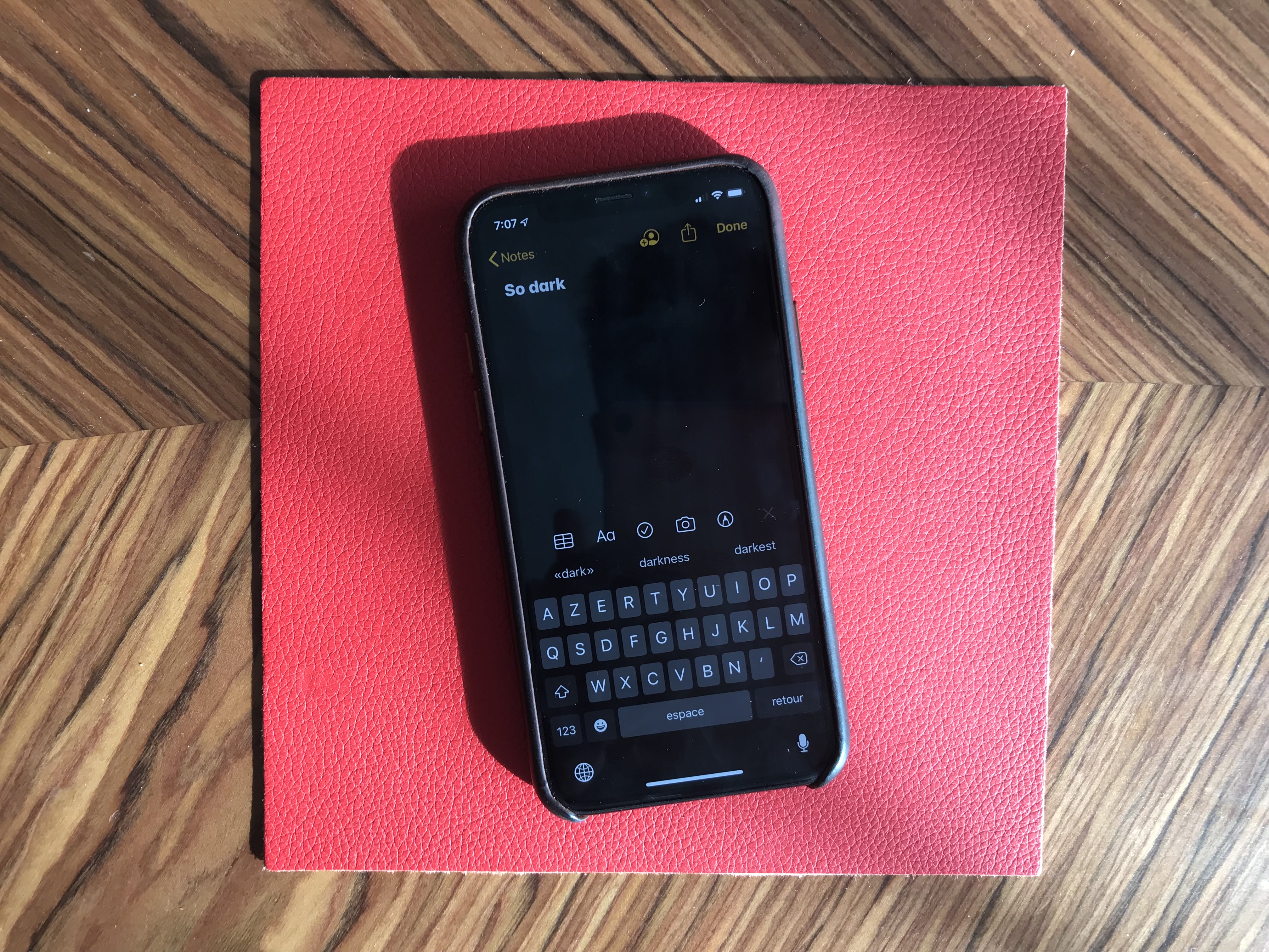
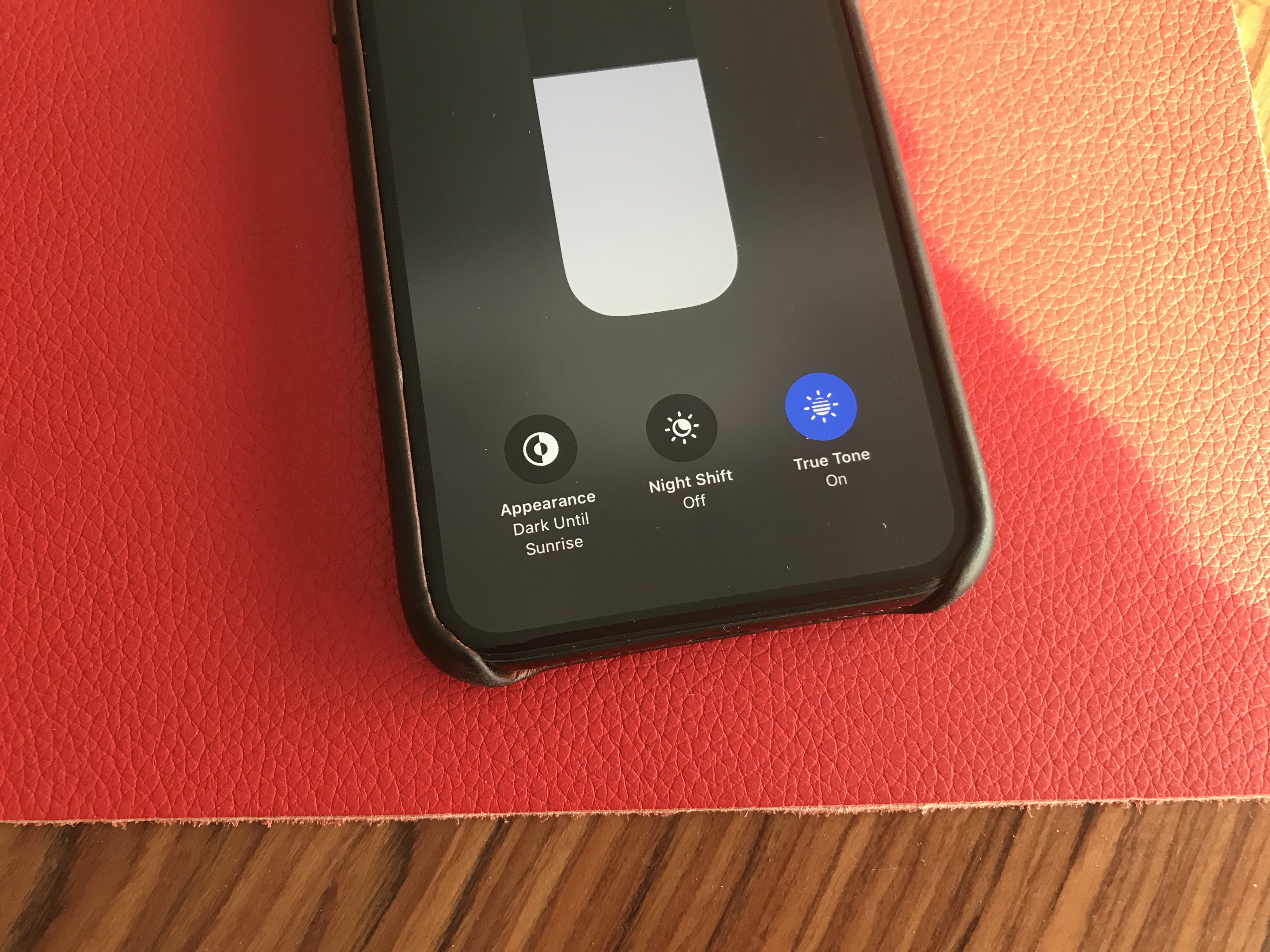
Dark Mode is here, and it looks great. It’s a system-wide trigger that completely transforms the look and feel of your iPhone — you have to play with it to really feel the difference. The easiest way to activate it is by opening the Control Center panel, long pressing on the brightness indicator and turning it on.
While you can trigger it manually, you can also select an automated mode in the settings. Right now, my phone becomes dark at night and lights up in the morning. iOS uses your current location to time the change with the sunset and sunrise.
Widgets, notifications and menus now use black or transparent black as much as possible. You can choose new Apple wallpapers that change when you turn on Dark Mode, or you can optionally dim your custom wallpapers at night.
Apple has updated all its apps to support Dark Mode, from Notes to Mail, Messages, Safari and more. And it works really well with those apps.
But the issue is that many third-party apps haven’t been updated for Dark Mode yet. So it’s a disappointing experience for now, but I’m sure many app developers will update their apps before the final release of iOS 13.
Many apps already support a dark version that you can trigger in the app settings. But Apple really wants third-party developers to follow the system-wide option going forward. So those apps will have to be updated as well.
iOS still looks like iOS. But if you carefully pay attention to your first experience of iOS 13, you’ll notice two things. First, animations have been sped up — it feels like unlocking your phone, opening and closing an app or swiping on a notification are much faster. It’s hard to know if those actions have been optimized or if it’s just Apple hitting the fast-forward button.
Second, Face ID is better. It’s not a dramatic change, but your phone recognizes you a tiny bit faster than before. iPhone users will appreciate that they don’t have to buy a new phone for this free improvement.
The two other iOS 13 changes that you can experience in any app is that the keyboard now supports swipe-to-type and the share sheet has been updated. It is now separated in three areas: a top row with suggested contacts to send photos, links and more depending on your most important contacts.
Under that row of contacts, you get the usual row of app icons to open something in another app. If you scroll down, you access a long list of actions that vary from one app to another.
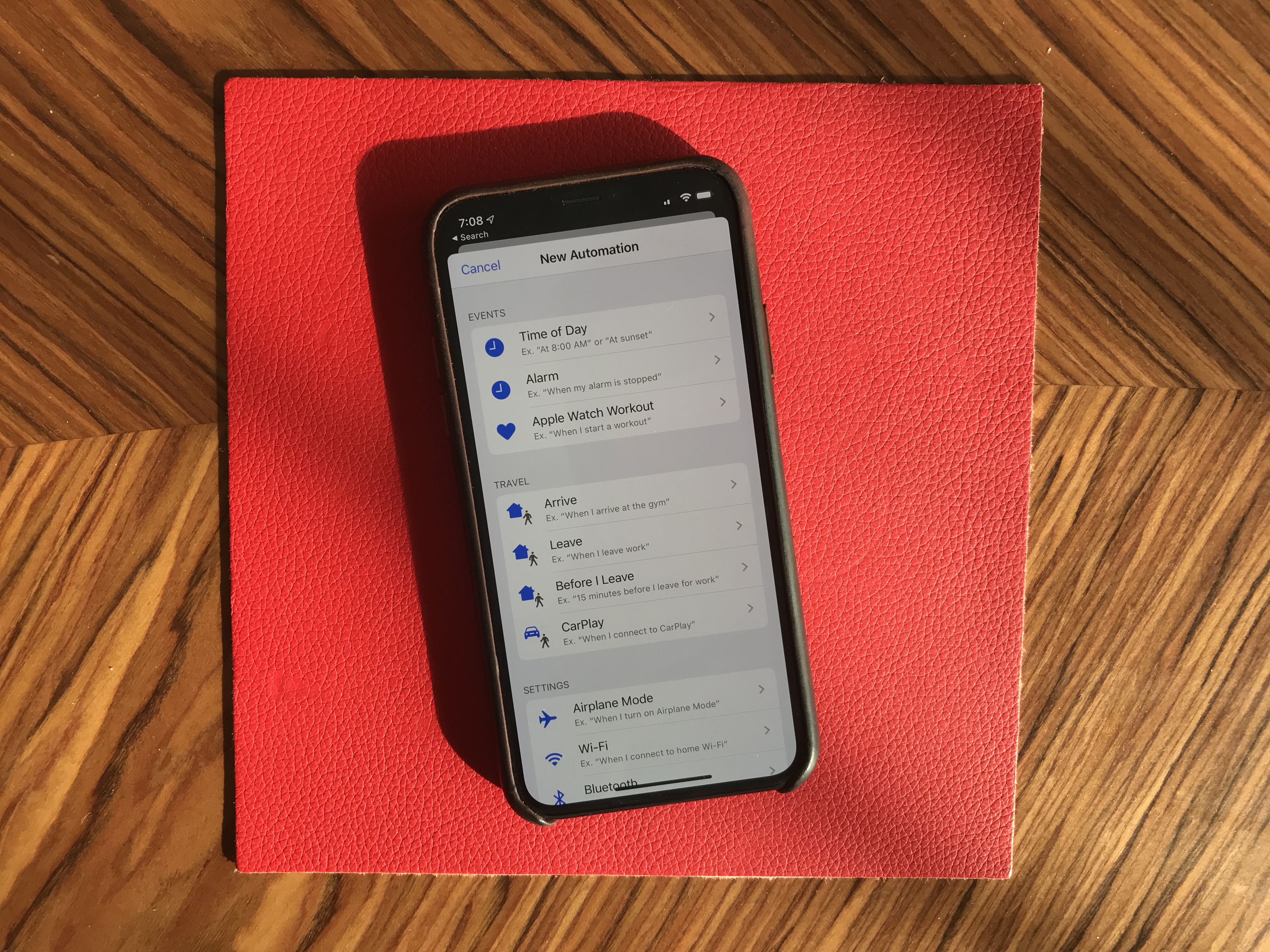
Siri and the Shortcuts app have been improved and now work more closely together. In addition to a more natural Siri voice, Shortcuts is now installed by default with iOS, which is great news for automation and scripting on your phone.
And I was surprised to see all my voice-activated Siri Shortcuts in the Shortcuts widget. For instance, since iOS 12, I’ve been able to say “Hey Siri, I’m heading home with Citymapper” to launch Citymapper with directions to my home. There’s now a button in the Shortcuts app to trigger that Siri Shortcut.
More interestingly, you can now create automated triggers to launch a shortcut. For instance, you can create scenarios related to CarPlay, a location or even a cheap NFC tag. Here are some examples:
All first-party apps have been improved in one way or another. Some changes are small, but a few apps have received a massive update.
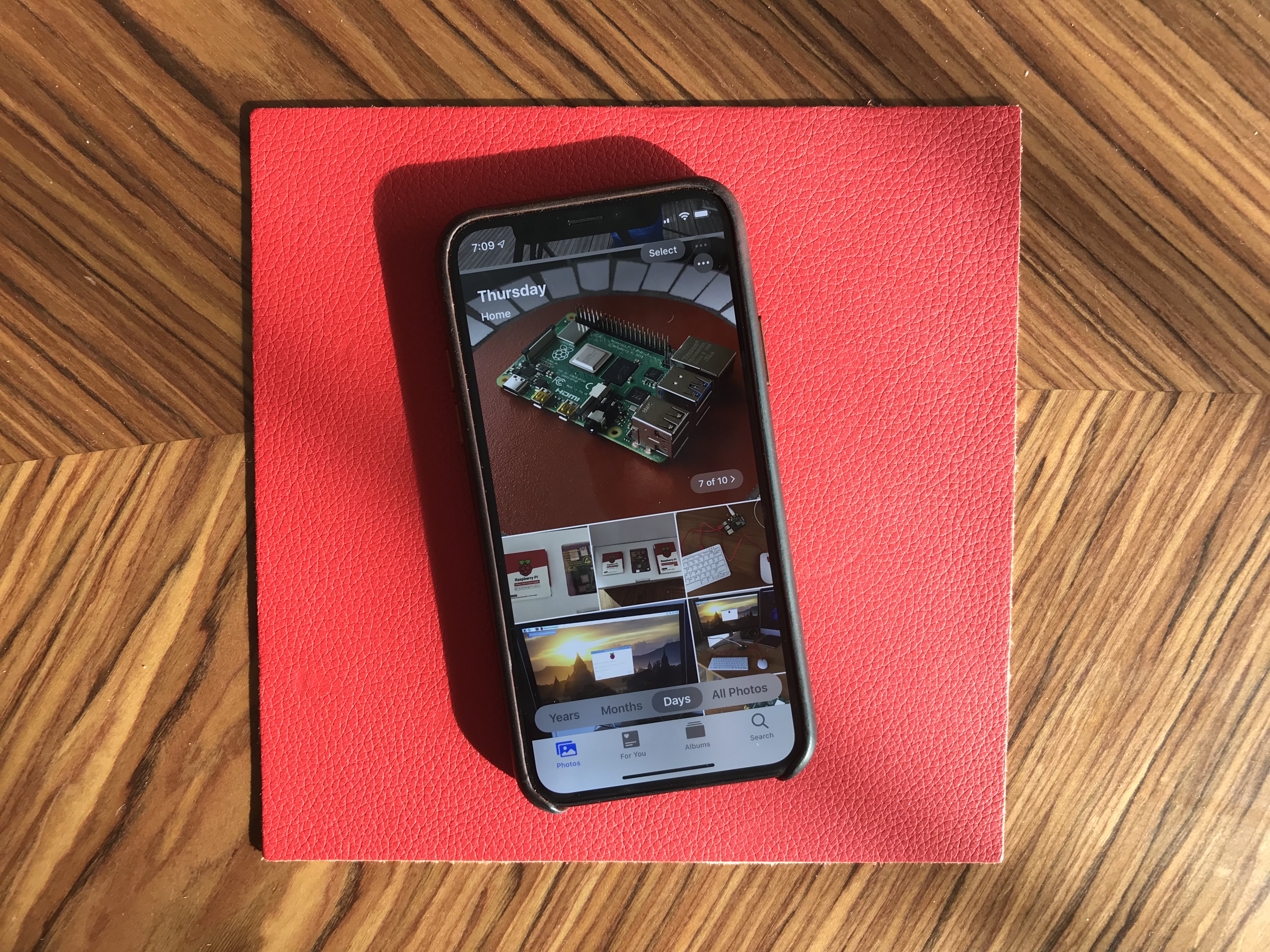
Photos looks completely different with a new main tab. Instead of a relatively boring-looking grid of photos, you now get four sub-tabs that should help you navigate your photo library more efficiently.
‘Years’ lets you jump straight to a specific year. The ‘Months’ view is the most interesting one as iOS tries to sort your photos in smart albums based on dates and locations. When you open an event, you get the best photos of this event in the ‘Days’ tab. Some photos, such as duplicates, are hidden by default.
And the last tab, ‘All Photos,’ features the traditional never-ending grid of all your photos in your camera roll. Everything is still there. Live photos and videos now automatically play by default in some views. I’ve never been a fan of autoplaying videos but I guess that’s what people like.
The camera has been slightly improved, especially when it comes to Portrait mode with better segmentation of hair. And photo editing has been redesigned — it looks more like VSCO now.
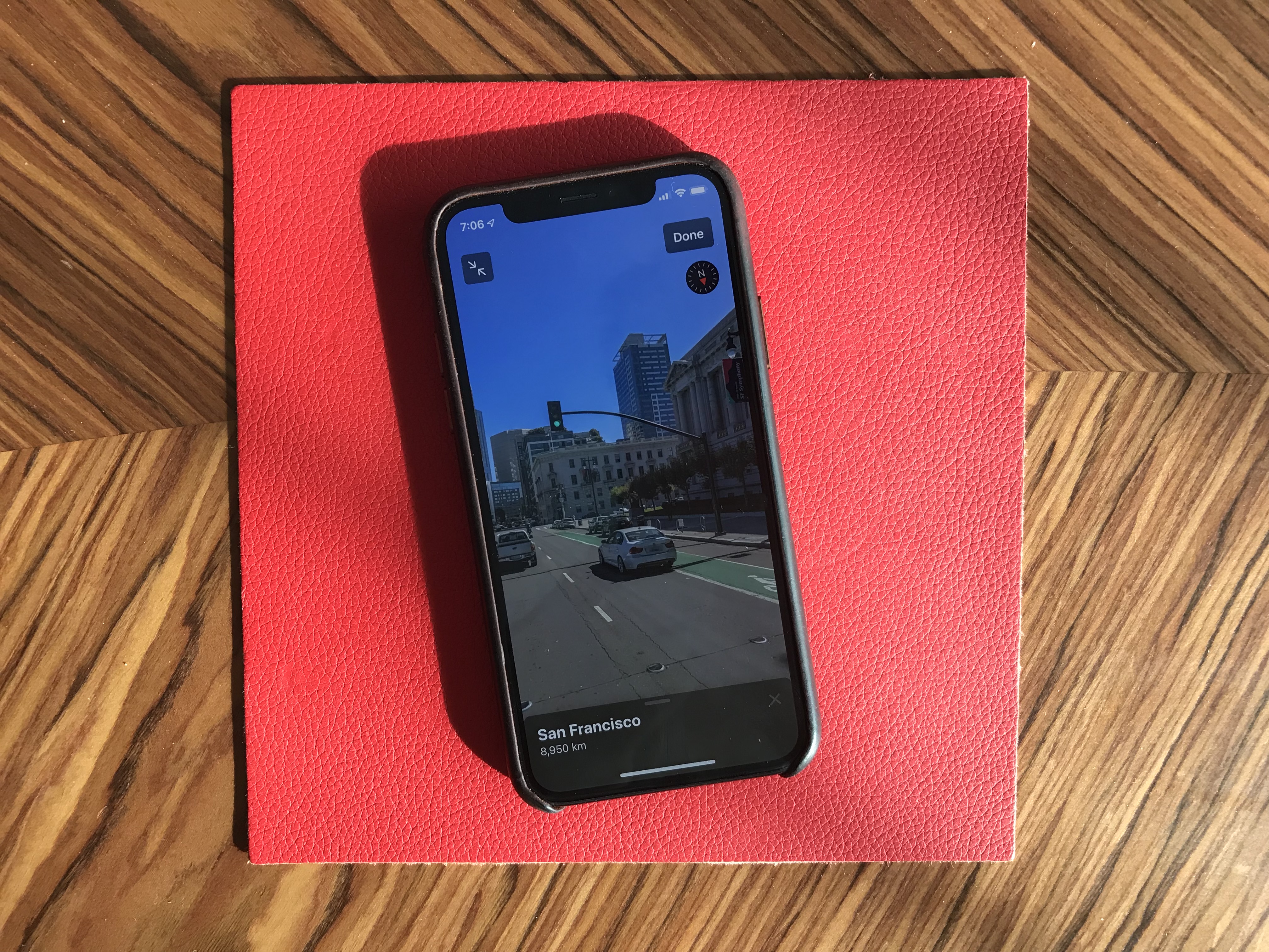
While Maps is getting a gradual update with better mapping data, most people won’t notice changes for a while. You can see real-time transit data, your flight status and share lists of places with friends, though. It might not replace Citymapper, FlightLogger or Mapstr, but more contextual data is key when it comes to competing with Google Maps.
Speaking of Google Maps, there’s a new Look Around feature that could have been called Apple Street View. I recommend trying the feature in San Francisco because it’s stunning. This isn’t just 360 photo shots — those are 3D representations of streets with foregrounds and backgrounds.
Messages is getting some much-needed improvements. You can now choose a profile name and profile picture and share it with your contacts. I hate the default grey avatar, so it’s great to let people push a profile picture to other people.
If you have a Memoji-compatible device, you can now share Memoji stickers. If you’ve used Bitmoji in the past, this is Apple’s take on Bitmoji. And finally, search has been improved and is now actually useful. You can find an address or a specific message in no time.
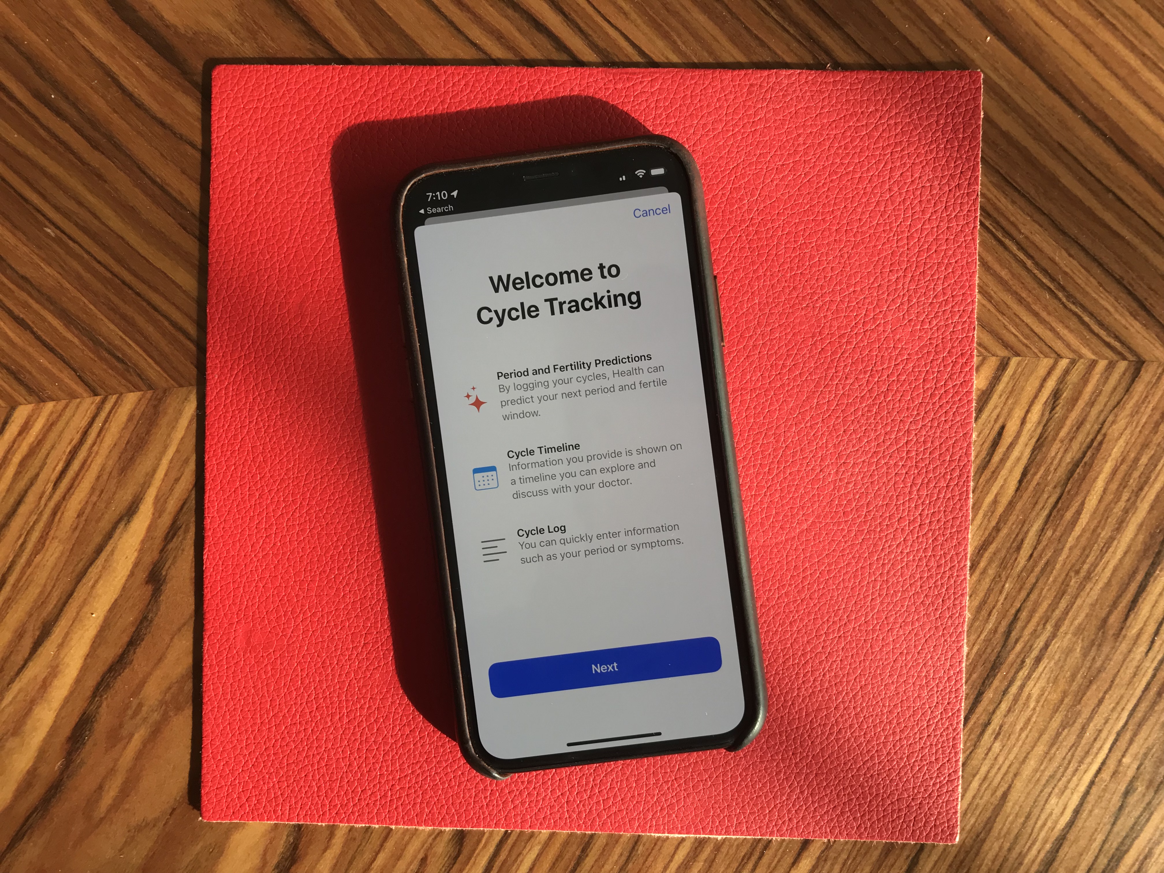
Health has been redesigned but features more or less the same data. But it’s worth noting that Apple now lets users track, visualize and predict menstrual cycles from the Health app.
iOS 13 has a big emphasis on privacy as well thanks to a new signup option called “Sign In with Apple.” I couldn’t try it as I couldn’t see the option in any app. But Sarah Perez already wrote a great explainer on the topic.
In a few words, this button will let you create an account for a service without inputing an email address and password, and without connecting with your Google or Facebook account. Apple keeps as little data as possible — it’s all about creating a unique identifier and storing that in your iCloud keychain.
Apple is adding more ways to control your personal information. If an app needs your location for something, you can now grant access to your location just once. The app will have to ask for your permission the next time. Similarly, iOS 13 can tell you when an app has been tracking your location in the background with a map of those data points.
But I didn’t realize iOS 13 also blocks Bluetooth scanning by default in all apps. Many apps scan for nearby Bluetooth accessories and compare that with a database of Bluetooth devices around the world. In other words, it’s a way to get your location even if you’re not sharing your location with this app.
You now get a standard permission popup for apps that actually need to scan for Bluetooth devices — Mobike uses Bluetooth to unlock bikes and Eve uses Bluetooth to interact with connected objects, for instance. But the vast majority of apps have no reason to scan for Bluetooth devices. You can decline Bluetooth permission and use Bluetooth headphones normally.

Let’s go through some tiny little updates:
Overall, iOS 13 feels like a breath of fresh air. Everything works slightly better than it used to. None of the changes are outrageous or particularly surprising. But they all contribute to making iOS a more enjoyable platform.
Powered by WPeMatico
This is your opportunity to get a glimpse of the future of iOS — and iPadOS. Apple just released the first public beta of iOS 13 and iPadOS 13, the next major version of the operating systems for the iPhone and iPad. Unlike developer betas, everyone can download those betas without a $99 developer account. But don’t forget, it’s a beta.
The company still plans to release the final version of iOS and iPadOS 13.0 this fall (usually September). But Apple is going to release betas every few weeks over the summer. It’s a good way to fix as many bugs as possible and gather data from a large group of users.
As always, Apple’s public betas closely follow the release cycle of developer betas. And Apple released the second developer beta of iOS and iPadOS 13 just last week. So it sounds like the first public beta is more or less the same build as the second developer build.
But remember, you shouldn’t install an iOS beta on your primary iPhone or iPad. The issue is not just bugs — some apps and features won’t work at all. In some rare cases, beta software can also brick your device and make it unusable. Proceed with extreme caution.
I’ve been using the developer beta of iOS and it’s still quite buggy. Some websites don’t work, some apps are broken.
But if you have an iPad or iPhone you don’t need, here’s how to download it. Head over to Apple’s beta website and download the configuration profile. It’s a tiny file that tells your iPhone or iPad to update to public betas like it’s a normal software update.
You can either download the configuration profile from Safari on your iOS device directly, or transfer it to your device using AirDrop, for instance. Reboot your device, then head over to the Settings app. In September, your device should automatically update to the final version of iOS and iPadOS 13 and you’ll be able to delete the configuration profile.
Here’s a quick rundown of what’s new in iOS 13. This year, in addition to dark mode, it feels like every single app has been improved with some quality-of-life updates. The Photos app features a brand new gallery view with autoplaying live photos and videos, smart curation and a more immersive design.
This version has a big emphasis on privacy as well thanks to a new signup option called “Sign in with Apple” and a bunch of privacy popups for Bluetooth and Wi-Fi consent, background location tracking. Apple Maps now features an impressive Google Street View-like feature called Look Around. It’s only available in a handful of cities, but I recommend… looking around as everything is in 3D.
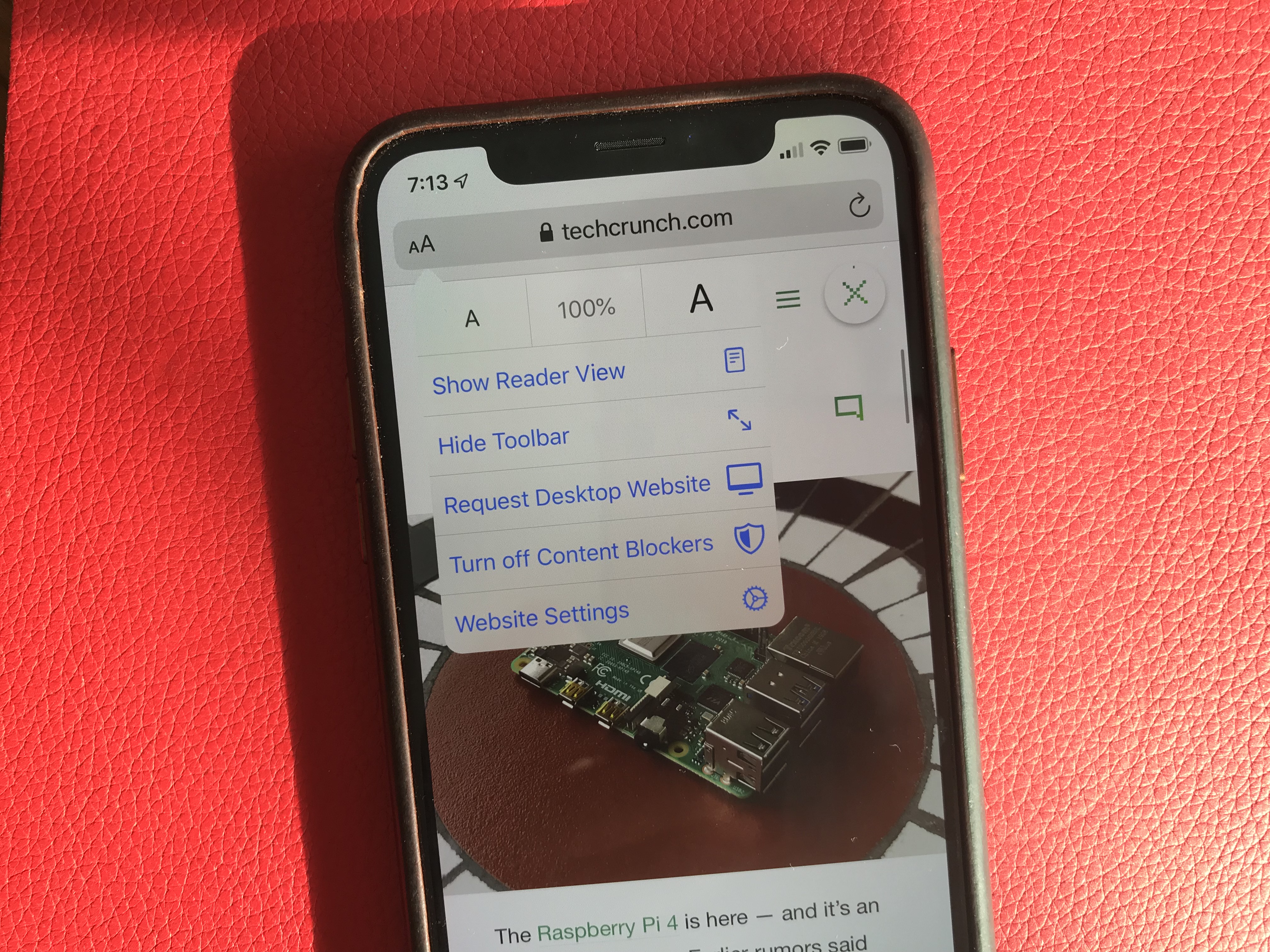
Many apps have been updated, such as Reminders with a brand new version, Messages with the ability to set a profile picture shared with your contacts, Mail with better text formatting options, Health with menstrual cycle tracking, Files with desktop-like features, Safari with a new website settings menu, etc. Read more on iOS 13 in my separate preview.
On the iPad front, for the first time Apple is calling iOS for the iPad under a new name — iPadOS. Multitasking has been improved, the Apple Pencil should feel snappier, Safari is now as powerful as Safari on macOS and more.
Powered by WPeMatico
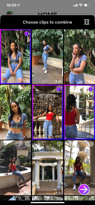
Trash is a new startup promising to make it easier for anyone to create well-edited videos.
Social video is an area that CEO Hannah Donovan knows well, having previously served as general manager at Vine (the video app that Twitter acquired and eventually shut down). She said that in user research, even though people had “really powerful cameras in their pockets,” when it came to editing their footage together, they’d always say, “Oh, I’m not technical enough, I’m not smart enough.”
Donovan, who also worked as head of creative at Last.fm, said she “got curious about whether we could use computer vision to analyze the video and synthesize it into a sequence.”
The result is the Trash app, which comes with a straightforward tag line: “You shoot, we edit.”
Donovan demonstrated the app for me last week, shooting a few brief clips around the TechCrunch New York office, which were then assembled into a video — not exactly an amazing video but much, much better than anything I could have done with the footage. We also got to tweak the video by adjusting the music, the speed or the “vibe,” then post it on Trash and other social networks.
Donovan founded the company with its Chief Scientist Genevieve Patterson, who has a Ph.D. from Brown and also did postdoctoral work with Microsoft Research.
Patterson told me that Trash’s technology covers two broad categories. First there’s analysis, where a neural network analyzes the footage to identify elements like people, faces, interesting actions and different types of shots. Then there’s synthesis, where “we try to figure out what are the most cool and interesting parts of the video, to create a mini-music video for you with a high diversity of content.”
The app should get smarter over time as it gets more training data to work with, Patterson added. For one thing, she noted that most of the initial training footage used “Hollywood-style cinematography,” but as Trash brings more users on-board, it can better adapt to the ways people shoot on their phone.
It’s starting that on-boarding process now with what Donovan calls a “creator beta,” where the team is looking for a variety of creators — particularly talented photographers who haven’t embraced video yet — to try things out. You can request an invite by downloading the iOS app. (Donovan said there are plans to build an Android version eventually.)

Trash has raised $2.5 million from sources as varied as the National Science Foundation, Japan’s Digital Garage and Dream Machine, the fund created by former TechCrunch Editor Alexia Bonatsos. Donovan said the startup isn’t focused on revenue yet — but eventually, it could make money through sponsorships, pro features and by allowing creators to sell their footage in the app.
And if you’re wondering where the name comes from, Donovan offered both a “snarky response” (“I don’t give a damn and I don’t take myself too seriously”) and a more serious one.
“We believe that one person’s trash is another person’s treasure,” she said. “With filmmaking, as you know, there’s a lot of things that get left on the cutting room floor. That’s one of the product concepts, in the longer term, that we want to explore.”
View this post on InstagramA post shared by TRASH (@thetrashapp) on
Powered by WPeMatico
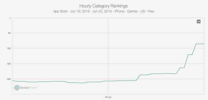
Harry Potter: Wizards Unite, the highly anticipated new mobile game from Pokémon GO makers Niantic and Warner Brothers’ games division, is off to a good start, but it’s not breaking Pokémon GO records. According to preliminary estimates from Sensor Tower, the new game has been installed some 400,000 times in its first 24 hours in its launch markets of the U.S. and U.K. — where the game arrived ahead of schedule on Thursday. Gross player spending in these markets hit around $300,000 across both iOS and Android during this time.
This is not the full picture, however.
The game was also available in Australia and New Zealand during a pre-launch beta trial of sorts, and is only now rolling out to worldwide users on a country-by-country basis. During its beta test period, Sensor Tower estimates the game grossed around $80,000.
But in the same number of days, Pokémon GO grossed $1.6 million in those two markets.
Following its U.S. launch, it took Harry Potter: Wizards Unite around 15 hours to reach the No.1 position on the iOS App Store. This ascension is also going a bit slower than Pokémon GO did when it arrived. That game was an immediate hit, debuting at No. 1 on its launch day of July 6, 2016. It was then installed 7.5 million times in the U.S. during its first 24 hours. And it didn’t reach the U.K. until seven days later.
In its first 24 hours, Pokémon GO became the No. 1 app by revenue in the U.S., as well. The new Harry Potter title is ranked No. 102 overall for iPhone revenue and No. 62 among top grossing games, Sensor Tower says. It’s also No. 48 for U.K. revenue. (It’s not yet ranked on Google Play.)
App Annie hasn’t yet put out numbers related to Harry Potter: Wizards Unite’s revenue, but the company tells us it hit No. 1 in the U.S. for downloads as of 12 AM on June 21, 2019. And for consumer spending, App Annie says the game broke into the top 100 grossing games by hitting No. 63 as of 7:00 AM June 21 on iPhone in the U.S.
The new game’s lesser demand compared with Pokémon GO could be attributed to a number of factors. Pokémon GO was hugely anticipated, had a massive fan base ready to download and was one of the first compelling use cases of AR in gaming.
Harry Potter’s fan base is active as well, but they’ve also had other games to play before now.
For example, Jam City has a Harry Potter: Hogwarts Mystery game that’s been getting a huge boost since yesterday’s news of the new Niantic title. That points to a case of mistaken identity or perhaps clever App Store SEO… or both.
It’s also worth noting the App Store itself has changed in the years since Pokémon GO’s launch.
In September 2017, Apple introduced its brand-new App Store that took the emphasis off its Top Charts as a means of discovery, and instead features apps in editorial “stories” on its Today tab. Within the dedicated apps and games section, the revamped App Store points users to editorial collections, with Top Charts only found upon scrolling down the page quite a bit.
We’ve heard from some developers that these changes reduced their downloads, as getting into the Top Charts doesn’t drive numbers like it used to. They said getting into the Today tab’s feature editorial doesn’t send as many installs, either. But this is all anecdotal — and of course, Apple doesn’t talk about numbers like this. Further investigation is needed.
In any event, the two app store intelligence firms — App Annie and Sensor Tower — both predict big numbers for the new Harry Potter title over time.
Sensor Tower estimates the game will pull in $400 million to $500 million in revenue in its first year. However, the firm notes that Harry Potter isn’t as popular in Asia — a market that delivers Pokémon GO over 40% of its revenue.
App Annie, meanwhile, predicts the game will hit $100 million in consumer spend in its first 30 days. (Pokémon GO hit this milestone in two weeks.)

“Pokémon GO shattered mobile gaming records, clearing $100 million in its first two weeks and becoming the fastest game to reach $1 billion in consumer spend,” noted App Annie. “While we don’t expect it to surpass Pokémon GO’s launch, Harry Potter: Wizards Unite is set to clear $100 million in its first 30 days — which is no small feat.”
Powered by WPeMatico

Just shy of three years ago, Pokémon GO took over the world. Players filled the sidewalks, and crowds of trainers flooded parks and landmarks. Anywhere you looked, people were throwing Pokéballs and chasing Snorlax.
As the game grew, so did the company behind it. Niantic had started its life as an experimental “lab” within Google — an effort on Google’s part to keep the team’s founder, John Hanke, from parting ways to start his own thing. In the months surrounding GO’s launch, Niantic’s team shrank dramatically, spun out of Google, and then rapidly expanded… all while trying to keep GO’s servers from buckling under demand and to keep this massive influx of players happy. Want to know more about the company’s story so far? Check out the Niantic EC-1 on ExtraCrunch here.
Now Niantic is back with its next title, Harry Potter: Wizards Unite. Built in collaboration with WB Games, it’s a reimagining of Pokémon GO’s real-world, location-based gaming concept through the lens of JK Rowling’s Harry Potter universe.
I got a chance to catch up with John Hanke for a few minutes earlier this week — just ahead of the game’s US/UK launch this morning. We talked about how they prepared for this game’s launch, how it’s built upon a platform they’ve been developing across their other titles for years, and how Niantic’s partnership with WB Games works creatively and financially.

Greg Kumparak: Can you tell me a bit about how all this came to be?
John Hanke: Yeah, you know.. we did Ingress first, and we were thinking about other projects we could build. Pokémon was one that came up early, so we jumped on that — but the other one that was always there from the beginning, of the projects we wanted to do, was Harry Potter. I mean, it’s universally beloved. My kids love the books and movies, so it’s something I always wanted to do.
Like Pokémon, it was an IP we felt was a great fit for [augmented reality]. That line between the “muggle” world and the “magic” world was paper thin in the fiction, so imagining breaking through that fourth wall and experiencing that magic through AR seemed like a great way to use the technology to fulfill an awesome fan fantasy.
Powered by WPeMatico
They’re not called Zuckerbucks, but Facebook just reinvented digital money. Facebook’s Libra cryptocurrency that will launch early next year is more like PayPal than Bitcoin — it’s designed to be easy enough for everyone to use. But it’s still complicated to understand, so I’m going to break it down for you nice and simple.
Watch our handy video above or read the transcript below.
Libra is like cash that lives inside your phone. How do you buy Facebook’s cryptocurrency? Starting in 2020, you’ll be able to purchase Libra through Libra wallet apps on your phone or from some local grocery and convenience stores. You cash in your local currency like dollars and get nearly the same number of Libra coins, which are represented by this wavy three-line emoji instead of the $ symbol. But first you’ll have to verify your identity with a photo.
![]()
You’ll then be able to spend your Libra while online shopping, or potentially pay for things like Ubers or your subscription for Spotify, since those companies have partnered with Facebook to make Libra popular. Since it’s almost free to digitally move Libra from one account to the other, you won’t have to pay high credit card processing fees that can add almost 4% to your total. And some Libra wallet apps and shops will give bonus discounts or free coins for signing up and paying with Libra.
You’ll also be able to send and request money from friends like you would with Venmo or PayPal. It’s as easy to send Libra as it is a message. In fact, Facebook is building its own Libra wallet app called Calibra that will live inside of WhatsApp, Facebook Messenger and its own standalone app.
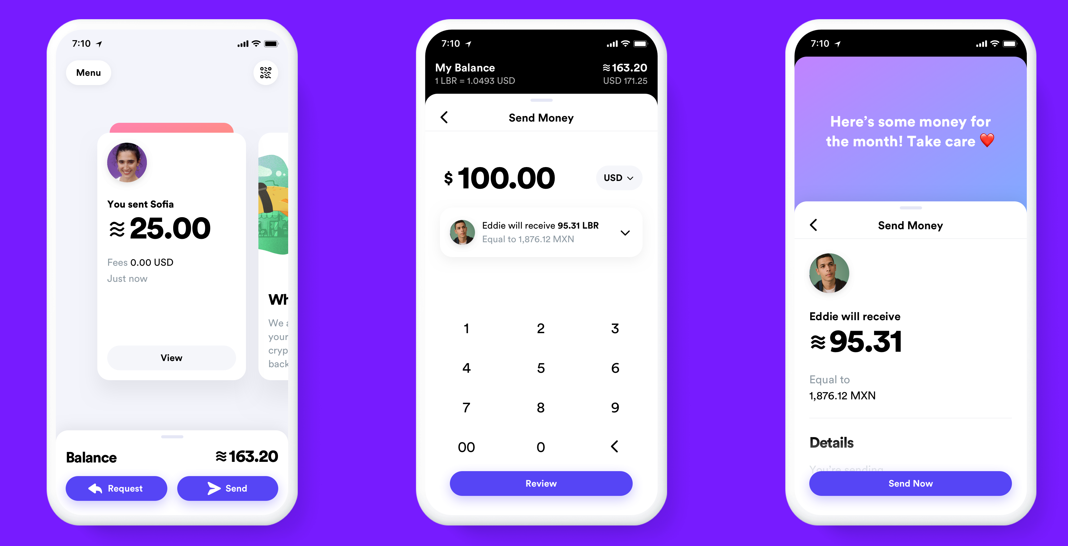
You won’t have to attach your real name and identity to any of your payments, but they will be public. Facebook knows it’s a little bit creepy and you probably don’t want it spying on what you buy. So Facebook set up a new company also called Calibra that will keep all your financial data separate from your Facebook profile. That means it can’t use your transaction data to target you with ads, re-order your News Feed or sell your info to marketers.
Eventually, Facebook hopes you’ll use Libra to pay your bills, scan your wallet’s QR code to purchase coffee or tap your phone to buy your public transit ticket. At any time, you can cash out of Libra and get your local currency back in your bank account, or handed to you at a local grocery store.

But how does the Libra cryptocurrency technically work…without a bunch of blockchain buzzwords? Libra is coded to have a stable price, be secure and be controlled not just by Facebook.
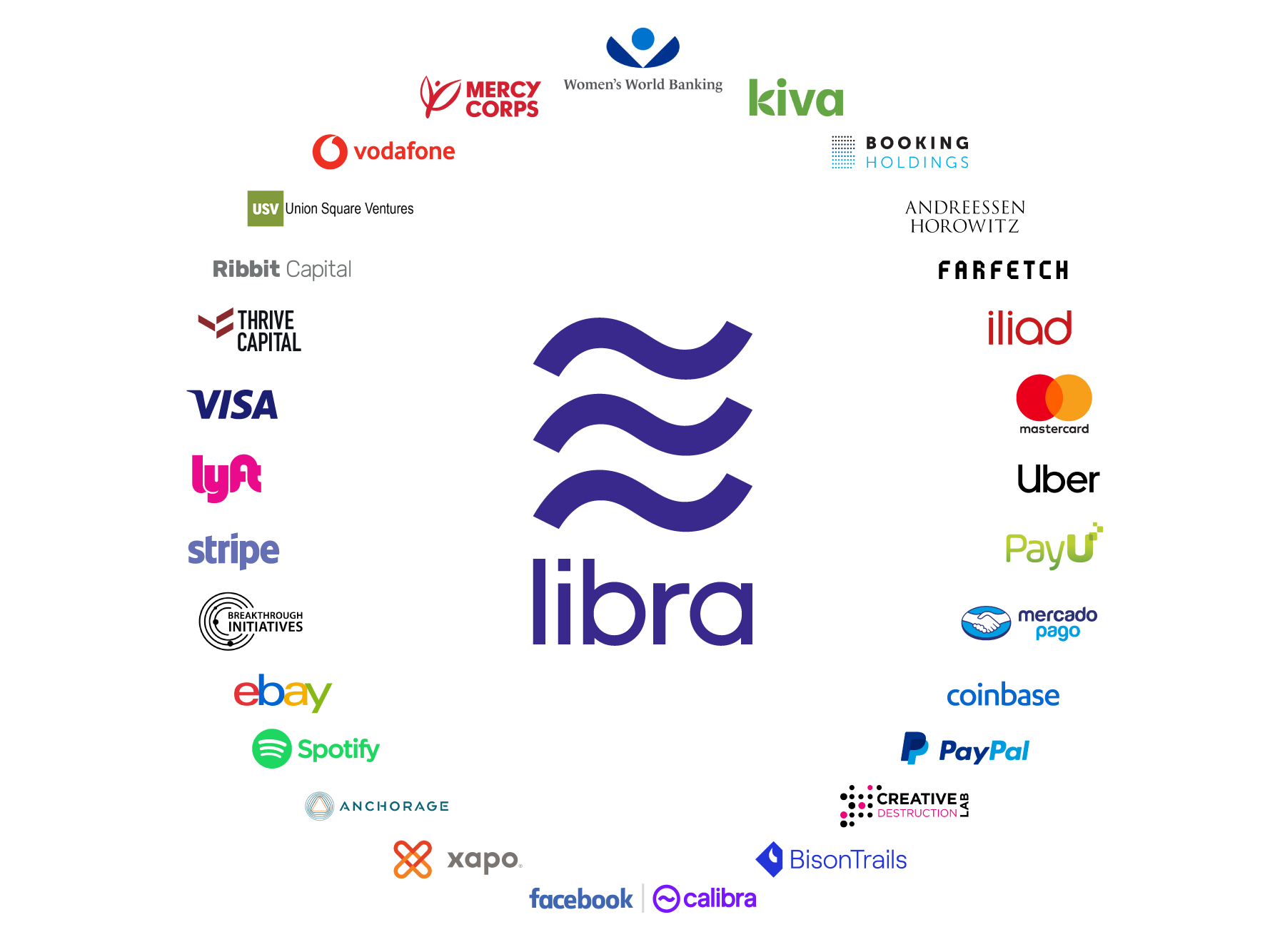
Instead, Libra is run by the 28-member Libra Association that it hopes will grow to 100 members by the time it launches in the first half of 2020. Financial companies like Visa and Mastercard, merchants and apps like eBay and Lyft, venture capital funds like Andreessen Horowitz and Union Square Ventures and nonprofits like Kiva are all members. They each paid at least $10 million to get one vote on the Libra council that controls what happens to the currency. They’ll be responsible for checking to make sure Libra transactions are real and creating the Libra Reserve.
Each time you cash in a dollar, that money goes into a big bank account called the Libra Reserve that creates and sends you roughly one Libra token. The Libra Reserve is made up of a collection of the most stable international currencies, like the U.S. dollar, British pound, the euro and the Japanese yen. The idea is that even if one of those currencies goes up or down in price, the value of the Libra will stay stable. That way, shops will accept the Libra as payment without worrying the value of the coin will drop tomorrow. Big swings in price are why older cryptocurrencies like Bitcoin or Ethereal haven’t grown popular as payment methods. Libra can also handle 1,000 transactions per second, while Bitcoin can only handle 7.
So how do Facebook and the other Libra Association members earn money? Off of interest on all the assets held in the Libra Reserve. After the Libra Association pays for its operations and investments in technology, members earns a cut of the remaining interest in proportion to how much they invested when they joined. If Libra gets popular, tons of people cash in and the reserve grows huge, the interest could add up to serious revenue for Facebook.
But there’s also a subtle second way Facebook could get rich from Libra. If the currency makes it easier for small businesses to accept payments online, they’ll sell more stuff. They’ll then have extra money to spend on Facebook ads, which will make it extra quick to buy things with Libra. Ninety million small businesses already have Facebook Pages, but Facebook only has 7 million advertisers. If it can turn more of those local merchants into ad buyers, Facebook’s revenues could skyrocket.
The big risk of Libra is that anyone will be able to develop apps for it. That could lead to another Cambridge Analytica situation. But instead of some shady app maker snatching your personal info, they could steal your digital currency. Facebook and the Libra Association say they won’t vet Libra developers, which leaves the door wide open to abuse. And if people get scammed, they’ll blame Facebook.

But if Facebook succeeds, the real win could be for the 1.7 billion people left in poverty with no bank account around the world. They’re exploited by international money sending services like Western Union or Monogram that charge steep 7% fees that take $50 billion away from families per year. And if they’re mugged, they could lose all their money since they have nothing stored online. All they’ll need is a photo ID and Libra could give them an alternative to a bank account that’s tougher to steal and could make it easy to pay for what they need.
There are plenty of reasons to worry that Libra could give Facebook and other tech giants more power or lead to people getting scammed. But it could also give disadvantaged people everywhere a way to join the modern economy. And at least it’s not called FaceCoin.
And if you want to know how Libra could spawn Facebook’s next scandal, read this:
Video by Gregory Manalo, b-roll via Libra Association
Powered by WPeMatico
 #gettrashed