Reviews
Auto Added by WPeMatico
Auto Added by WPeMatico

Portable consoles are hardly new, and thanks to the Switch, they’re basically the most popular gaming devices in the world. But ClockworkPi’s GameShell is something totally unique, and entirely refreshing when it comes to gaming on the go. This clever DIY console kit provides everything you need to assemble your own pocket gaming machine at home, running Linux-based open-source software and using an open-source hardware design that welcomes future customization.
The GameShell is the result of a successful Kickstarter campaign, which began shipping to its backers last year and is now available to buy either direct from the company or from Amazon. The $159.99 ( on sale for $139.99 as of this writing) includes everything you need to build the console, like the ClockworkPi quad-core Cortex A7 motherboard with integrated Wi-Fi, Bluetooth and 1GB of DDR3 RAM — but it comes unassembled.

You won’t have to get out the soldering iron — the circuit boards come with all components attached. But you will be assembling screen, keypad, CPU, battery and speaker modules, connecting them with included cables and installing them in the slick, GameBoy-esque plastic shell. This might seem like an intimidating task, depending on your level of technical expertise: I know I found myself a bit apprehensive when I opened the various boxes and laid out all the parts in front of me.
But the included instructions, which are just illustrations, like those provided by Lego or Ikea, are super easy to follow and break down the task into very manageable tasks for people of all skill levels. All told, I had mine put together in less than an hour, and even though I did get in there with my teeth at one point (to remove a bit of plastic nubbin when assembling the optional Lightkey component, which adds extra function keys to the console), I never once felt overwhelmed or defeated. The time-lapse below chronicles my entire assembly process, start to finish.
What you get when you’re done is a fully functional portable gaming device, which runs Clockwork OS, a Linux-based open-source OS developed by the company. It includes Cave Story, one of the most celebrated indie games of the past couple of decades, and a number of built-in emulators (use of emulators is ethically and legally questionable, but it does provide an easy way to play some of those NES and SNES games you already own with more portability).
There’s a very active community around the GameShell that includes a number of indie games to play on the console, and tips and tricks for modifications and optimal use. It’s also designed to be a STEM educational resource, providing a great way for kids to see what’s actually happening behind the faceplate of the electronics they use everyday, and even getting started coding themselves to build software to run on the console. Loading software is easy, thanks to an included microSD storage card and the ability to easily connect via Wi-Fi to move over software from Windows and Mac computers.
Everything about the GameShell is programmable, and it features micro HDMI out, a built-in music player and Bluetooth support for headphone connection. It’s at once instantly accessible for people with very limited tech chops, and infinitely expandable and hackable for those who do want to go deeper and dig around with what else it has to offer.
Swappable face and backplates, plus open 3D models of each hardware component, mean that community-developed hardware add-ons and modifications are totally possible, too. The modular nature of the device means it can probably get even more powerful in the future too, with higher capacity battery modules and improved development boards.
I’ve definitely seen and used devices like the GameShell before, but few manage to be as accessible, powerful and customizable all at once. The GameShell is also fast, has great sound and an excellent display, and it seems to be very durable, with decent battery life of around three hours or slightly more of continuous use depending on things like whether you’re using Wi-Fi and screen brightness.
Powered by WPeMatico

The official Sega Genesis Mini is coming in September and hopes to capitalize on some of the retro gaming hype that turned the Super Nintendo and NES Mini Classic editions into best-sellers. But there’s already a modern piece of hardware out there capable of playing Sega Genesis games on your HDTV — plus Mega Drive, Master System and Sega CD, too.
The Analogue Mega Sg is the third in a series of reference-quality, FPGA-based retro consoles from Analogue, a company that prides itself on accuracy in old-school gaming. It provides unparalleled, non-emulated gameplay with zero lag and full 1080p output to work with your HD or even 4K TV in a way no other old-school gaming hardware can.
For $189.99 (which is just about double the asking price of the Sega Genesis Mini), you get the console itself, an included Master System cartridge adapter, an HDMI cable and a USB cable for power supply (plus a USB plug, though, depending on your TV, you might be able to power it directly). The package also includes a silicon pad should you want to use it with original Sega CD hardware, which plugs into the bottom of the SG hardware just like it did with the original Genesis. It includes two ports that support original wired Genesis controllers, or you can also opt to pick up an 8bitdo M30 wireless Genesis controller and adapter, which retails for $24.99.
Like the Nt mini did for NES, and the Super Nt did for SNES before it, the Mega Sg really delivers when it comes to performance. Games look amazing on my 4K LG OLED television, and I can choose from a variety of video output settings to tune it to my liking, including adding simulated retro scaliness and more to make it look more like your memory of playing on an old CRT television.
Sound is likewise excellent — those opening notes of Ecco the Dolphin sounded fantastic rendered in 48KHz 16-bit stereo coming out of my Sonos sound system. Likewise, Sonic’s weird buzzsaw razor whine came through exactly as remembered, but definitely in higher definition than anything that actually played out of my old TV speakers as a kid.
Even if you don’t have a pile of original Sega cartridges sitting around ready to play (though I bet you do if you’re interested in this piece of kit), the Mega Sg has something to offer: On board, you get a digital copy of the unreleased Sega Genesis game “Hardcore,” which was nearly complete in 1994 but which went unreleased. It’s been finished and renamed “Ultracore,” and you can run it from the console’s main menu as soon as you plug it in and fire it up.
Analogue plans to add more capabilities to the Mega Sg in the future, with cartridge adapters that will allow it to run Mark III, Game Gear, Sega MyCard, SG-1000 and SC-3000 games, too. These will all be supported by the FPGA Analogue designed for the Mega Sg, too, so they’ll also be running natively, not emulated, for a true recreation of the original gaming experience.

If you’re really into classic games, and care a lot about accuracy, this is definitely the best way to play Sega games on modern TVs — and it’s also just super fun.
Powered by WPeMatico
The TwelveSouth StayGo is a new USB-C dock from a company that makes a ton of great and unique Mac and iOS device accessories. True to the company’s track record, it offers a slightly different take on a popular accessory category — and ends up excelling as a result.
The StayGo’s unique twist is a short USB-C to USB-C cable that slots right into a dedicated compartment on the dock, offering portable connectivity without any awkward stubby permanently attached cord. It also avoids the problem that direct USB-C dock connectors have, where they stick out and can potentially get damaged in your bag or scratch other stuff. There’s a second, three-foot cable included in the box, too, which you can conveniently just plug into your Mac at home if you switch between a desktop and a MacBook, or a Mac and an iPad.
It seems like a pretty simple thing, but having these two cables instead of just one, and the stowable short cable, make this far more convenient for anyone who travels or who does any out-of-home work at all. I’ve used a ton of these things, and StayGo is my clear favorite after having used it on a couple of trips over a month or so of testing.
I haven’t even talked about the ports yet — TwelveSouth nailed the right mix there, too, with three high-speed USB 3.0 ports, an Ethernet port, a USB-C connector (with pass-through charging at up to 85W), a 4K 30Hz HDMI port and both SD and microSD slots (which support UHS-I transfer speeds, and which can operate simultaneously). That’s just about everything a traveler or working photographer today needs, and nothing they don’t — all in a space-saving design that never makes you choose between it and other gear when you’re packing even the smallest bag.
In terms of performance, so far it’s been rock solid. There’s nothing worse than random unmounting of memory cards when you’re trying to transfer photos from a shoot, and the StayGo is definitely able to deliver solid, uninterrupted performance there. If I had any complaints, it’s that video output isn’t 60Hz, but that’s not really a necessary requirement for something that I’ll be using primarily to supplement my external monitor needs when I’m on the road, instead of a dedicated video connection for a video editing setup, for instance.
The StayGo can get a bit warm when operating, but it’s never been actually hot, and the aluminum case construction helps ensure it can shed excess temp quickly.
At $99.99 it may be a bit more expensive than some of the hubs you can pick up on Amazon, but in terms of reliability, specs, port load out and its interesting approach to blending portability and at-home convenience, TwelveSouth is more than justified in setting that price point for the StayGo.
Powered by WPeMatico

Nintendo’s Mario Maker series is among the most generous gifts the company could have given to its fans, and the new installment on Switch is better than its predecessor in every way. Yet despite the freedom and encouragement it gives, it’s hard not to feel a gentle tug groundward when your ambitions begin to soar.
For those unfamiliar with Mario Maker, the original was a totally unexpected joy on the Wii U and one of the few games that truly took advantage of that console’s unusual hardware. It allowed players to use the touchscreen and stylus to put together Mario levels in a variety of styles, and the resulting number and complexity of creations boggled minds worldwide.
The sequel, Super Mario Maker 2, announced in February and released at the end of June, is a natural evolution of the previous game. It adds new items, new styles, new ways to sculpt the landscape and a variety of other complexifiers like conditions you can impose on players: no jumping, carry this item to the goal and so on.

A welcome addition is the robust tutorial for the maker mode, featuring the weird/cute duo Nina and Kawamura (a girl and a pigeon) walking the player through the tools and providing what amounts to platformer design 101. There’s also a single-player campaign: A hundred unconnected levels that let you have some good old Nintendo-designed Mario fun, but also serve as inspiration for how to use various blocks and level styles.

Within days of release, the “Course World” is already brimming with strange and fun levels to play, full of ingenious ideas and uses for blocks and enemies that will have you shaking your head — and biting your controller with rage. There’s even a whole category for “auto-Mario” levels (a strange and wonderful genre that sprang out of the original Mario Maker) that take the player through an adventure sometimes without any input at all.
Importantly, this game adds a few things that Mario levels really need: locked doors and keys, for instance, or checkpoints so players don’t have to replay a punishing section. That opens up things considerably and already I have seen lots of interesting levels taking advantage of this to make you visit multiple areas, beat a certain enemy before proceeding, and such.

This devious little level is nothing like Mario, yet uses Mario rules
I’ll let other reviews go into detail about the various more granular improvements the game makes. Suffice it to say here that it’s a ton of fun, making levels is hard and between the single-player, multiplayer and Course World modes, Mario Maker 2 more than justifies its purchase price. For my part I want to call attention to something I feel is important about the game and the carefully thought-out limitations it places on creators.
Nintendo’s zeal for seeking and destroying copyright violations is well known; just last week we had Mario Royale shut down almost instantly. And the company is also well known for its highly conservative stance on licensing, in some ways at least — for instance, only ever letting Zelda games appear on Nintendo consoles rather than having them come out on Sony and Microsoft platforms as well. There are plenty of good reasons for that, I’m just making a note of it.
Nintendo’s fan base, however, is the only one that rivals it for zeal, and over the years they have found many ways to modify or reuse the properties that Nintendo has been happy to either let lie or recycle tamely via Virtual Console. Nintendo would never, for example, have made Mario Royale. Nor would it make something like the A Link to the Past Randomizer, which changes the locations of items in the classic game to make each playthrough unique. (A similar one exists for Super Metroid and other beloved and much-played classics.)
Again, Nintendo’s philosophy forbids many of these things — their idea of games is a much more pure one and it’s hard to fault it when the results are things like Super Mario Odyssey and Breath of the Wild. But players want more, and they regularly do whatever they can to break Nintendo’s creations out of the carefully manicured walled gardens the company has long cultivated for them.
Enter Mario Maker.
This title essentially performs a bleed on the community that is so fervently dedicated to playing Nintendo’s games outside of Nintendo’s rules. By letting players make their own levels, and by giving them a tool that’s really quite powerful to do so, they remove a great deal of the pressure that has built up and resulted in things like rom hacks.

A course I’m working on: Infiltrating Moleville
The second game especially opens up the creative floodgates, since the new items and capabilities make possible the complex levels that have made up the best of Mario from the beginning. Straight-up platforming is always fun, but Nintendo’s level designers have learned to theme each level with a specific skill set or feel in mind, and the sequel’s tools enable that to take place in a much greater way than before.
And yet there are some purposeful omissions. The most purposeful is the lack of any ability to tie together levels using an overworld map or even a 1-1, 1-2, 1-3 structure. While it’s possible some creators may be able to circumvent this in a small way, this is a clear sign from Nintendo that this is a tool for making levels, not games.
Withholding higher structure (that could be as simple as designing playlists) is a strategic move that reserves that structure for official games. And allowing for easy sharing of levels and playlists, instead of relying on Nintendo’s own algorithms and onerous number-based sharing system, makes it trivial for the company to control the means of distribution.
 Again, I’m not saying they shouldn’t, exactly — and there will be thousands and thousands of levels worth playing, more than any one player could possibly want. But what’s clear from the popularity of Mario Maker is that millions of players also want to see Nintendo’s creations unbound by Nintendo’s strict rules. And while Mario Maker 2 loosens those rules considerably, it also indicates the limits of what Nintendo is willing to allow its community to do.
That said, within those limits there are near infinite variations and, in fact, it’s probable that the game’s creators deliberated intensely on what to include and what to exclude. I’m desperately missing the invincible giant moles from SMW, but would having them (and a dozen other rare critters) in the enemy selection just clutter it up? I’d like to have an overworld, but for the casual maker or speedrunning level maker, wouldn’t that really just be an extra step that would be skipped more often than not? The intention of the game is to facilitate creation, but part of that is knowing what tools not to provide.
Ultimately my wish that Nintendo demolish the walls of its garden amounts to nothing more than asking them to give away the keys to the castle, so to speak. And it’s not like I’m being oppressed here — I can barely put together a decent course of my own, and others are happy to work within these constraints. Not being a genius Maker myself, I tend to see the restrictions rather than the possibilities.
I just want more Mario, and in fact more Mario than Nintendo is willing to give. With Mario Maker it has secured me a constant drip-feed of Mario-adjacent content that’s just enough to keep me playing but also just limited enough that I look forward with immense impatience to the next “real” game. Whether that’s a kindness or a cruelty I can’t say, but whatever it is, it’s going to take up a hell of a lot of my time over the next couple of years.
Powered by WPeMatico
The concept of an IRL heads-up display has been a part of science fiction since basically the beginning. Big players have tried their hand at it with less than stellar results — most notably Google with Glass, and more recently Intel’s Vaunt. But North may have cracked the nut on smart glasses with Focals.
They are not perfect by any stretch of the imagination — they’re slightly heavy and don’t feel quite as seamless as science fiction promised they would — but this may be the best pair of smart glasses yet.
Focals were created by North, a Canadian company backed by Intel Capital, Spark Capital and the Amazon Alexa Fund with nearly $200 million in funding. Around the time Google Glass was released, founders Aaron Grant, Matthew Bailey and Stephen Lake were working on a smart arm band. They were disenchanted, as were many, with Glass and sought to make something better.
Their first priority? Make a great pair of glasses, then outfit them with technology. In order to do that, they had to allow for prescription lenses, which means the lenses of their product had to be curved. This throws a huge wrench in the idea of lens-projected notifications and content, so Focals created its own special projector.
The company also felt that the touchpad on the side of Google Glass was overly cumbersome, leading them to build the Focals Ring to let users navigate the menu.
The Focals are technically AR glasses, but they’re not focused on gaming or content consumption. The product is designed to move notifications from your phone to your sightline. It’s a bit like an Apple Watch for your face.
These notifications include the date and time, the weather, text notifications, email, Slack, Apple News alerts, Uber notifications, sports scores, turn-by-turn navigation and more. Users navigate this content using the Ring, outfitted with a nub of a joystick, which is meant to be worn on the index finger of your dominant hand.
Users can proactively seek information by clicking the joystick and scrolling, but the headset also serves up information in a push notification, including incoming messages and emails.
Importantly, North implemented a smart response system to keep users from having to pick up their phone each time they get a notification. The system gives users two options: choose from a list of smartly generated responses, or use speech-to-text through Focals’ built-in Alexa integration (the system is listening via built-in mic — but wearers have to opt-in during set up).
However, one of the great advantages for the Focals is also one of its weaknesses. The company chose to build a custom pair of glasses that could work with Rx lenses. That also means that the eyebox (the surface where you can see the projection) is smaller than other AR gadgets, which often use waveguides. In other words, your Focals have to be positioned pretty near perfectly to see the image. The company works hard to make sure that’s the case, fitting the glasses to your specific face. But glasses shift and move throughout the day, which means there’s plenty of re-adjusting in order to see the picture.
All that said, the Focals look surprisingly good. In fact, passersby would be hard-pressed to detect that they’re smart glasses in the first place. They aren’t comfortable enough to wear all day — the extra weight on the front means they get a bit uncomfortable after a few hours. But overall, these are pretty discreet as far as smart glasses go.
It’s a relatively time-consuming process to get your hands on a pair of Focals. Because the fit and size are so important to usability, users interested in purchasing a pair must go to one of North’s two stores (there’s one in Toronto, and one in Brooklyn, NY).
The visit to the store is by appointment. Upon arrival, store associates will take you into a booth where you’ll sit before 11 cameras that will 3D model your head, determining where your eyes and ears sit relative to the rest of your face. The cameras also try to understand your gaze.
From there, you get a demo with a standard (not fitted) pair of Focals, during which you learn how to align the Focals and use the Ring. It takes a few weeks for your custom-fit Focals to be ready to pick up, at which point you go through a final sizing with an optician.
It’s tedious, and will be difficult for the company to scale, but it’s part of what gives Focals an edge in quality. Luckily for folks outside of Toronto and NY, Focals is heading off on a pop-up tour. You can check out the tour dates and locations here.
“Why?” is perhaps the toughest question to answer when it comes to the Focals. The goal, as outlined by the company, is to keep you connected to the digital world without taking you out of the real world. In short, stop looking down at your phone.
That said, Focals also take away the option. When your phone rings, or even when your Apple Watch buzzes, you have a choice to make: look down, or ignore. When you’re wearing the Focals, that decision is eliminated.
For this reason, I feel like this product is meant for early adopters and folks who enjoy being ultra-connected to the digital world. If you’re already addicted to the sweet chime of your phone, the Focals may very well keep you more connected to the real world, and potentially save your neck from some stiffness. But if you do well to live in the real world and don’t appreciate the constant flow of notifications to your phone, the Focals likely won’t help you maintain that separation.
There are also some minor issues with the Focals themselves. The Ring isn’t super comfortable, particularly when typing on a computer (something most of us spend hours each day doing). The Ring also seems like something that would be very easy to lose or break — this hasn’t happened to me yet, but I wouldn’t be surprised if it did. (For now, North is replacing broken Rings for free.)
With the Focals themselves, I’d like to be clear when I say that I was pleasantly surprised with the overall experience. The UI is pleasant to look at, and the little chime of a notification that whispers in your ear is most certainly addictive.
However, I found my eyes getting tired after more than an hour wearing the Focals. Using the Focals means that you’re constantly changing the focus of your eyes from close to far away, which can be tiring. Moreover, if the glasses shift a bit on your face, the text of the notification can become fuzzy, making the experience even more tiring.
Plus, the glasses are built to bend halfway through the arms, as opposed to where the arms meet the frames. This means you can’t hang the Focals off the front of your shirt, which is an admittedly minor gripe, but it bugged me throughout the review process.
Add to that the fact that Focals start at $600 and this product is really for technophiles. For now.
North is on the right track. The company is constantly developing new features that are released each week — they recently launched Google Fit support to check your steps, as well as language lessons to brush up on your French during your walk to work. And they’ve started with the right priorities in mind. The Focals are fine looking glasses, and in general, the tech works. Now it’s about refinement.
Powered by WPeMatico

Drawing inspiration from games of yore but with dog and cat protagonists that signal light adventures rather than grim, dark ones, Gato Roboto and Dig Dog are easy to recommend to anyone looking to waste a couple hours this weekend. Not only that, but the latter was developed in a fascinating and inspiring way.
Both games share a 1-bit aesthetic that goes back many years but most recently was popularized by the inimitable Downwell and recently used to wonderful effect in both Return of the Obra Dinn and Minit. This is a limitation that frees the developer from certain concerns while also challenging them to present the player with all the information they need with only two colors, or in Dig Dog’s case a couple more (but not a lot).
In the latter game, you play as a dog, digging for bones among a series of procedurally generated landscapes populated by enemies and hazards. Dig Dug is the obvious callback in the name, but gameplay is more bouncy and spontaneous rather than the slower, strategic digging of the arcade classic.
On every stage you’re tasked with collecting a bone that’s somewhere near the bottom, while avoiding various types of enemies and traps or, if you so choose, destroying them and occasionally yielding coins. These coins can be traded with a merchant who appears on some stages, offering various gameplay perks like a longer dash or higher jump.

Get it! Get the bone!
The simple controls let you jump, dig, and do a midair dash that kills enemies — that’s pretty much it. The rest is down to moment-to-moment choices: dig around that enemy or go through them? If I go this way will I trap myself in this hole? Is it worth attacking that bat nest for a coin or will it be too hard to get out alive?
Collected bones contribute towards unlocking new stages with different, more dangerous enemies and devious traps. It gives a sense of progression even when you only get a bone or two, as does your dog rocketing back upwards in a brief but satisfying zoomies celebration every time. So even when you die, and you will die a lot, you feel like you’re working towards something.
It’s a great time-waster and you won’t exhaust its challenges for hours of gameplay; it’s also very easy to pick up and play a few stages of, since a whole life might last less than a minute. At $4 it’s an easy one to recommend.
Interestingly, Dig Dog was developed by its creator with only minimal use of his hands. A repetitive stress condition made it painful and inadvisable for him to code using the keyboard, so he uses a voice-based coding system instead. If I had been told I couldn’t type any more, I’d probably just take up a new career, so I admire Rusty Moyher for his tenacity. He made a video about the process here, if you’re curious:
Gato Roboto, for Switch and PC, is a much more complicated game, though not nearly so much as its inspirations, the NES classics Metroid and Blaster Master. In Gato Roboto, as in those games, you explore a large world filled with monsters and tunnels, fighting bosses and outfitting yourself with new abilities, which in turn let you explore the world further.
This one isn’t as big and open as recent popular “metroidvanias” like Hollow Knight or Ori and the Blind Forest — it’s really much more like a linear action-adventure game in the style of metroidvanias.
The idea is that you’ve crash-landed on a planet after tracking a mysterious signal, but the spaceman aboard the ship is trapped — you play his cat, Kiki, who must explore the planet in his stead.
At first (or shall I say fur-st) you really are just a cat, but you’re soon equipped with a power suit that lets you jump and shoot like any other action game. However, you frequently have to jump out of it to get into a smaller tunnel or enter water, in which the suit can’t operate (and the cat only barely). In this respect it’s a bit like Blaster Master, in which your pilot could dismount and explore caves in top-down fashion — an innovation that made the game one of my favorites for the system. (If you haven’t played the Switch remake, Blaster Master Zero, I implore you to.)
 Gato Roboto isn’t as taxing or complex as its predecessors, but it’s not really meant to be. It’s a non-stop romp where you always have a goal or an obstacle to overcome. The 1-bit graphics are so well executed that I stopped noticing them after a minute or two — the pixel art is very clear and only rarely does the lack of color cause any confusion whatever.
Like Dig Dog and Downwell before it, you can pick up color schemes to change the palette, a purely aesthetic choice but a fun collectible (some are quite horrid). The occasional secret and branching path keeps your brain working a little bit, but not too much.
The game is friendly and forgiving, but I will say that the bosses present rather serious difficulty spikes, and you may, as I did, find yourself dying over and over to them because they’re a hundred times more dangerous than ordinary enemies or environmental hazards. Fortunately the game is (kitty) littered with save points and, for the most part, the bosses are not overlong encounters. I still raged pretty hard on a couple of them.
It’s twice the price of Dig Dog, a whopping $8. I can safely say it’s worth the price of two coffees. Don’t hesitate.
These pleasant distractions should while away a few hours, and to me they represent a healthy gaming culture that can look back on its past and find inspiration, then choose to make something new and old at the same time.
Powered by WPeMatico

When you watch 2001: A Space Odyssey, do you find yourself criticizing HAL 9000’s machinations and thinking, “I could do better than that!” If so, Observation may be right up your alley. In it you play a space station AI called SAM that is called upon by the humans on board to help resolve a deadly mystery — though you may be a part of it yourself.
The game takes place in the near future on board the titular space station, a sort of expanded version of the ISS. You are booted up by astronaut Emma Fisher after an unspecified event that seems to have damaged the station. You, as the Systems Administration and Maintenance AI, are tasked with helping her as she first tries to simply survive the immediate aftermath, then starts to investigate what happened.
To do so you perform various tasks such a digital agent would do, such as unlocking and opening hatches, checking for system errors, collecting information from damaged laptops and so on. It’s mostly done through the many cameras mounted throughout the station, between which you can usually move freely and change the angle so you can get at this hatch or that scrap of paper on the wall.
 But from the beginning it’s clear that this is not a simple case of a micrometeorite or some other common space anomaly. I won’t spoil any of the surprises, but suffice it to say that like in 2001, the mystery runs deeper than that, and SAM itself is implicated.
Observation is a puzzle game that plays out in real time, though you are rarely presented with a task that needs to be completed in a rush — your commands are rarely an urgent “Open the pod bay doors, SAM!” and more “Something’s wrong with the cooling system, so this hatch won’t open, can you look into it?”
And so you search using your cameras for, say, the server that controls that system, or the scrap of paper that has its schematic so you can reboot it. These solutions are usually just a matter of being, well, observant, but occasionally can be frustrating gadget hunts where you don’t know what you’re looking for among the busy background of a working space station and the detritus of the disaster.
If you’re having trouble with something, chances are you’re overthinking it. I had to look up the solution to one situation, and it turns out I had simply overlooked some interactive objects because they looked so much like background. (For the record, it turns out you can turn stuff on and off at power outlets.)
 When you have to operate something, like an airlock, there is usually a little minigame to complete in which you must figure out which series of buttons to hit or hold — nothing too taxing, just a way to make it so you aren’t just pressing the Action Button all the time. The controls can be a bit clunky, such as one that had me hold down s to do one thing, then press and hold w at the same time. Do they not understand the same finger does both those things? Fortunately you can remap controls and although mouse movement is a bit stiff, there’s no need for twitchy response time.
Although the puzzles are a bit simplistic, it’s a pleasure navigating the station because it is so beautifully realized. The creators clearly did a ton of research and Observation, that is to say the station, is a convincing 21st century operation — cameras and laptops are stashed everywhere, and there are sticky notes from the Russian and Chinese denizens, luggage and experiments tucked away or half finished.
 It’s also all viewed through a combination of post-processing effects that make it all feel like you really are viewing it through a security camera system. These effects are a bit inconsistent — at one time you’ll hear what sounds like the whine of an 80s drive or system spinning up; others reflect a sort of Windows 98SE aesthetic; your own interface looks like something out of Terminator. It isn’t cohesive, exactly, but the truth is neither are the systems on board the ISS and other space hardware. And it’s a nice touch that lets the developer differentiate each part of the station and the different devices you connect to.
The modeling of the main character, Emma, is also excellent, though lapsing a bit into uncanny valley territory due to some clunky animations here and there. Maybe it’s just the microgravity. But one thing that can’t be faulted is the voice acting — Emma’s actor is brilliant, and other voices you encounter are also well done. Considering the amount of dialogue in the game, this could have been a dealbreaker, but instead it’s a pleasure to hear. Ambient audio is likewise lovely — wear headphones.
 The atmosphere is oppressive and tense, but not exactly scary; don’t expect a xenomorph to bust out of any vents, but also don’t expect Space Station Simulator 2019. This is a serious, adult (though not explicit or violent) sci-fi narrative and, from what I’ve played, a smart and interesting one.
I haven’t finished the game (which was sent to me in advance for review… but I’ve been in an intense love/hate relationship with Mordhau), but based on what I’ve played I can easily recommend Observation to anyone with a mind to take on mildly difficult puzzles and experience a well-presented story in a carefully crafted environment. Space buffs will also enjoy. At less than $25 right now (less with this week’s sale going on), I’d say it’s a no-brainer.
Observation released earlier this week on the Epic Games and PlayStation stores.
Powered by WPeMatico

OnePlus has never been particularly beholden to industry trends. Nowhere is that better demonstrated than with the 7 Pro. In the face of a stagnated smartphone market, Apple, Samsung and Google all went budget, releasing lower-tier takes on their pricey flagships to appeal to consumers looking for something akin to a premium experience without having to shell out four figures.
The 7 Pro, on the other hand, is OnePlus’ most premium device to date. But while the shift marks a break from much of the industry, it’s a very logical step for the company’s current trajectory. OnePlus made a name for itself creating low-cost flagship devices with features that were just slightly behind the bleeding edge.
In recent years, however, the company has looked to change that perception, becoming one of the first Android phones with an in-display fingerprint sensor and promising to be among the first to deliver 5G. The 7 Pro, however, marks a new era for the company. The existing six-month release strategy is still in place here (fittingly, given that Google has recently adopted something similar with its Pixel line), but the language OnePlus is using has shifted.
In a meeting ahead of launch, a rep for the company told TechCrunch OnePlus considers its twice-yearly phones to all be “flagships,” but the new model introduces the paradigm of “premium flagship” and “ultra-premium flagship.”
That’s a markety speak way of saying the company doesn’t compromise — which I think is a fair point. Oftentimes the concept of a “budget flagship” is heavily weighted toward the budget side of things. But OnePlus long ago established its knack for providing well-rounded, high-end smartphone experiences at well below the price of premium handsets.
The 7 Pro’s $669 starting price hedges much closer to the iPhone XR and Samsung Galaxy S10e’s $749 than the Pixel 3a’s $399. It’s also a pretty significant bump over the OnePlus 6T’s $549 starting point. It’s likely enough to make longtime fans of the service do a double take, but the sizable increase does come with a truly premium handset.
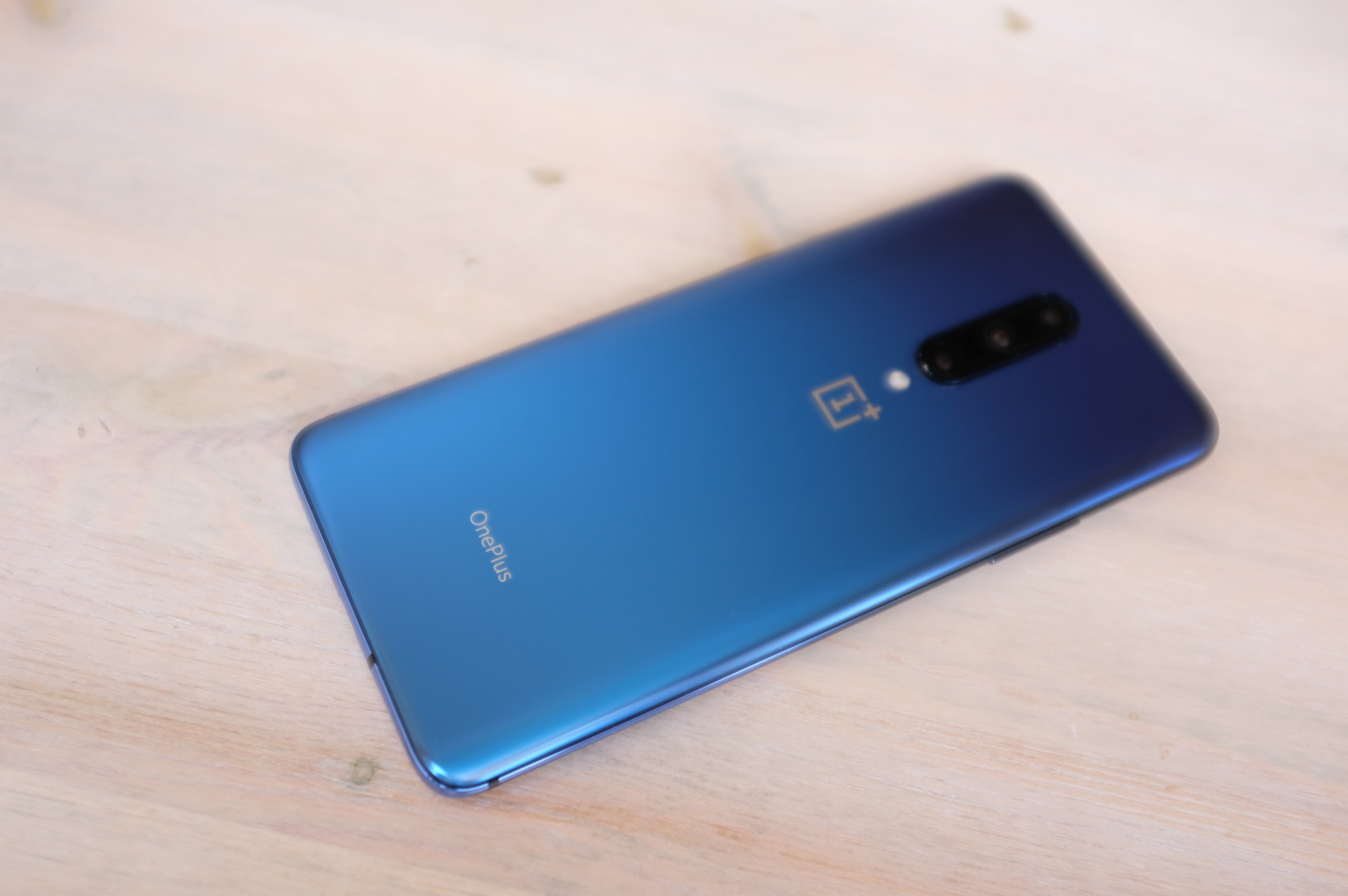
That starts with the design (though it’s certainly more than skin deep). This is immediately apparent with the 6.67-inch display. If curved sides of the edge to edge design are familiar, it’s because it was built custom for OnePlus by Samsung. And while it’s similar, it is, in fact, a custom design for the line, meaning that it’s still distinguished from the Galaxy line — namely the 516ppi density and a 90Hz refresh rate.
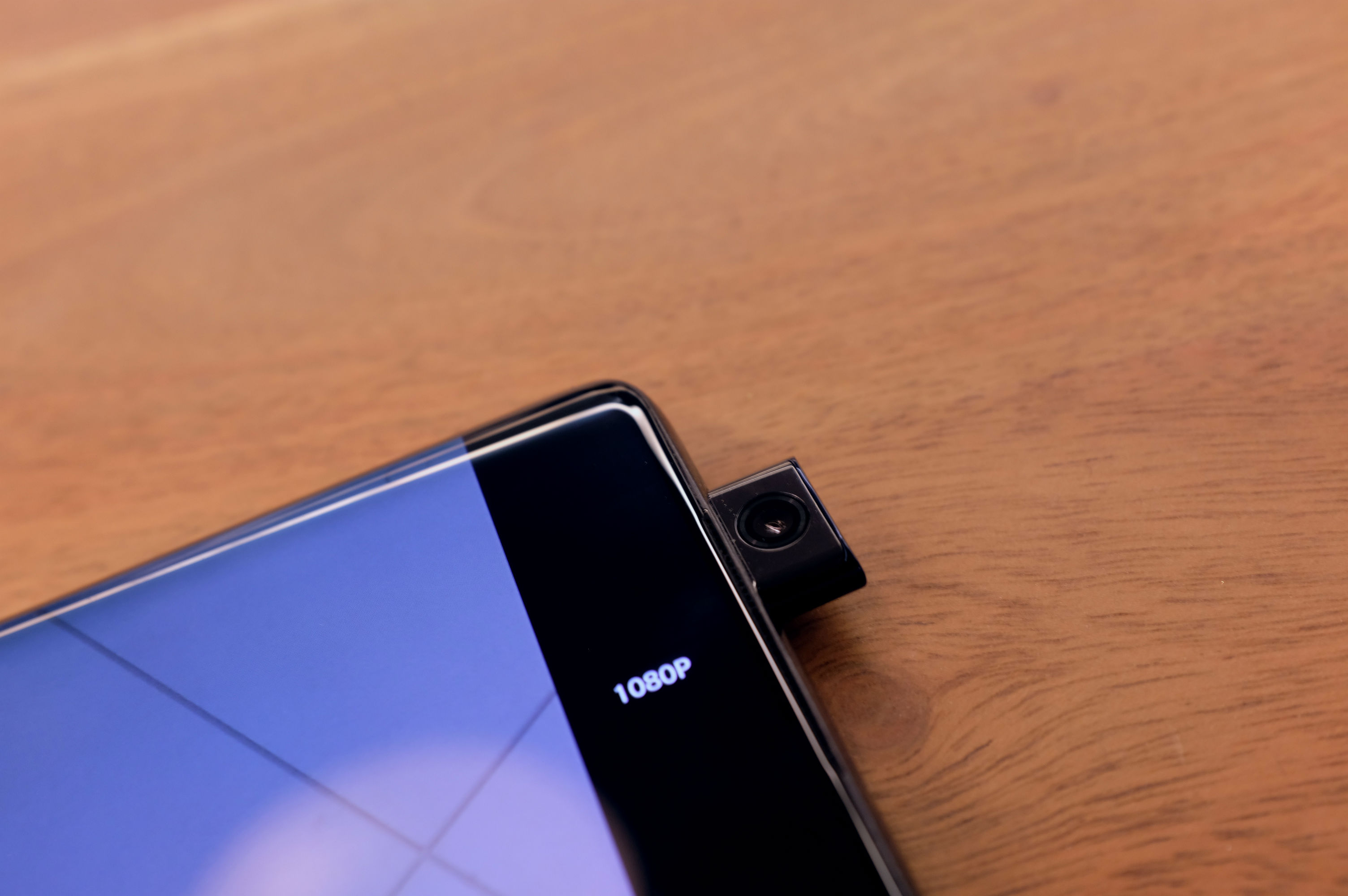
What’s really notable, however, is the complete absence of a notch or a pinhole. The 7 Pro takes another key step toward a world of uninterrupted screen time. Open the camera app, flip to front-facing and wait just under a second, as it mechanically extends on top of the device.
It’s not the first time we’ve seen the technology — fellow Chinese manufacturers Oppo and Vivo have already introduced us to pop-up cameras. But given OnePlus’ ongoing T-Mobile partnership, this is arguably the first time this technology has really been available to mainstream U.S. consumers.
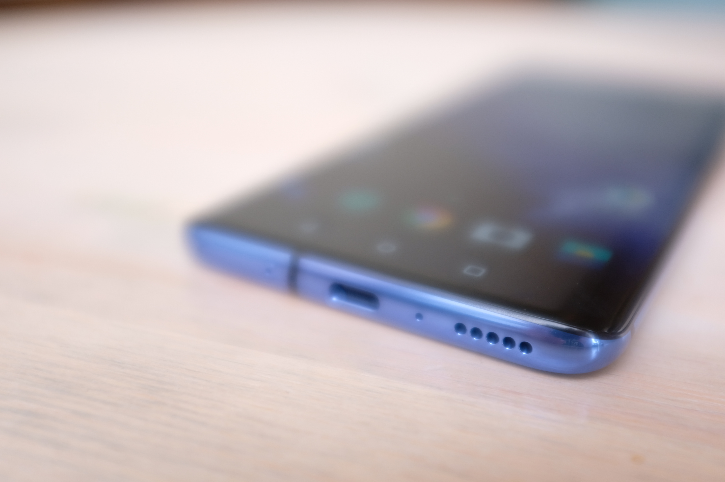
The execution is quite good. As someone who almost never takes selfies, I’ve come to appreciate the semblance of privacy of a hidden front-facing camera. If I need it, it’s just a tap of the screen away. There are some safety features built in, as well. Should it slip from your grip while the camera is out, the phone uses the accelerometer to automatically retract it. It will also automatically return home if the phone goes to sleep with it out.
OnePlus won’t say what this specifically means for things like water resistance. In fact, the company’s a little cagey on the subject — even recently taking to Twitter to brag that it didn’t submit for an IP rating, in order to lower the cost of the devices for the end user. Here’s a video of it dropping the new phone in a bucket:
Do with that what you will. It’s certainly clear why OnePlus would decide to skip elements it deemed unnecessary, but there is a certain peace of mind in knowing that a product has been submitted to rigorous testing by outside parties. The closest we got to a definitive answer was a recommendation against attempting to take an underwater selfie with the phone. So take that as you will.
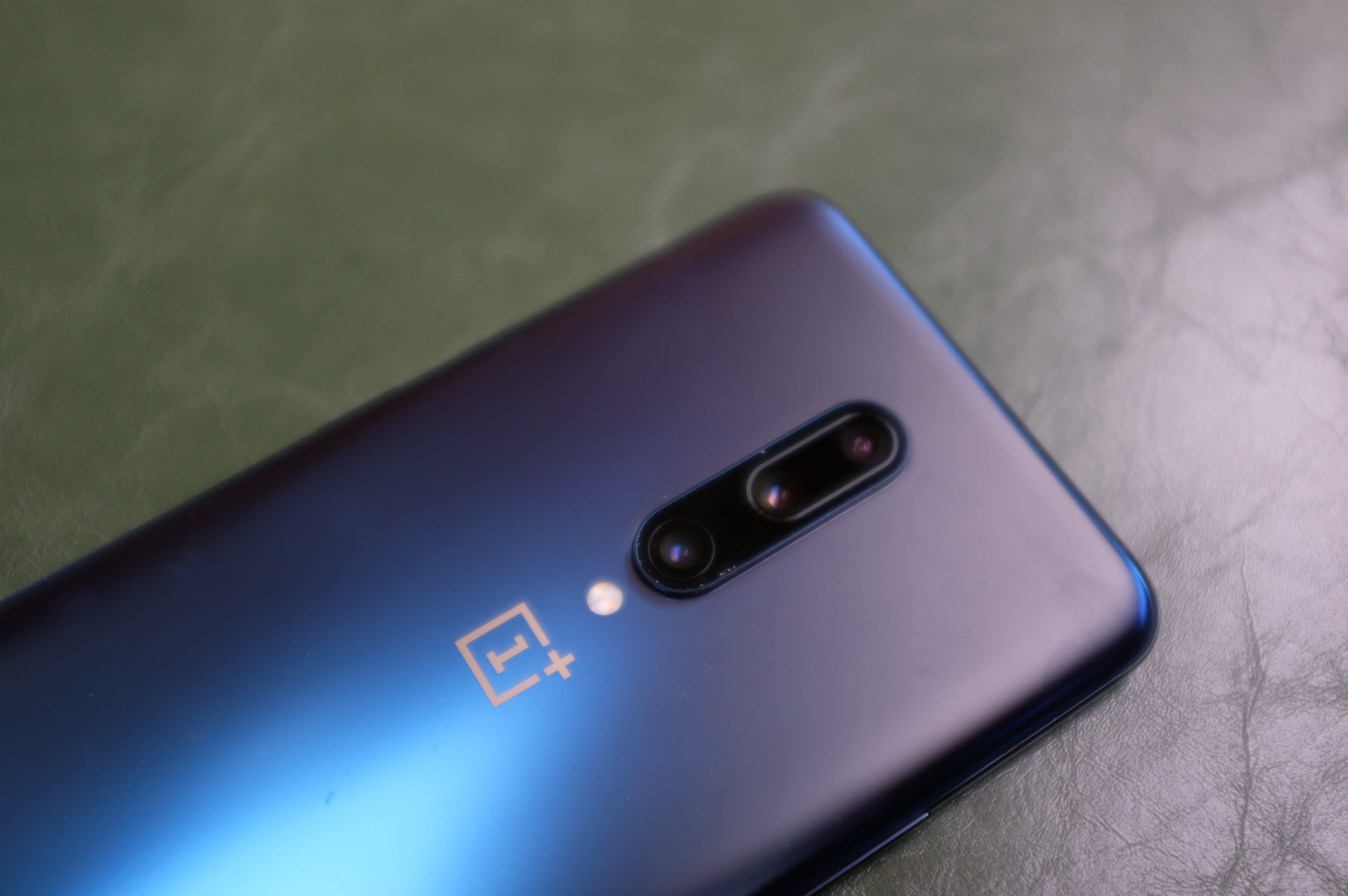
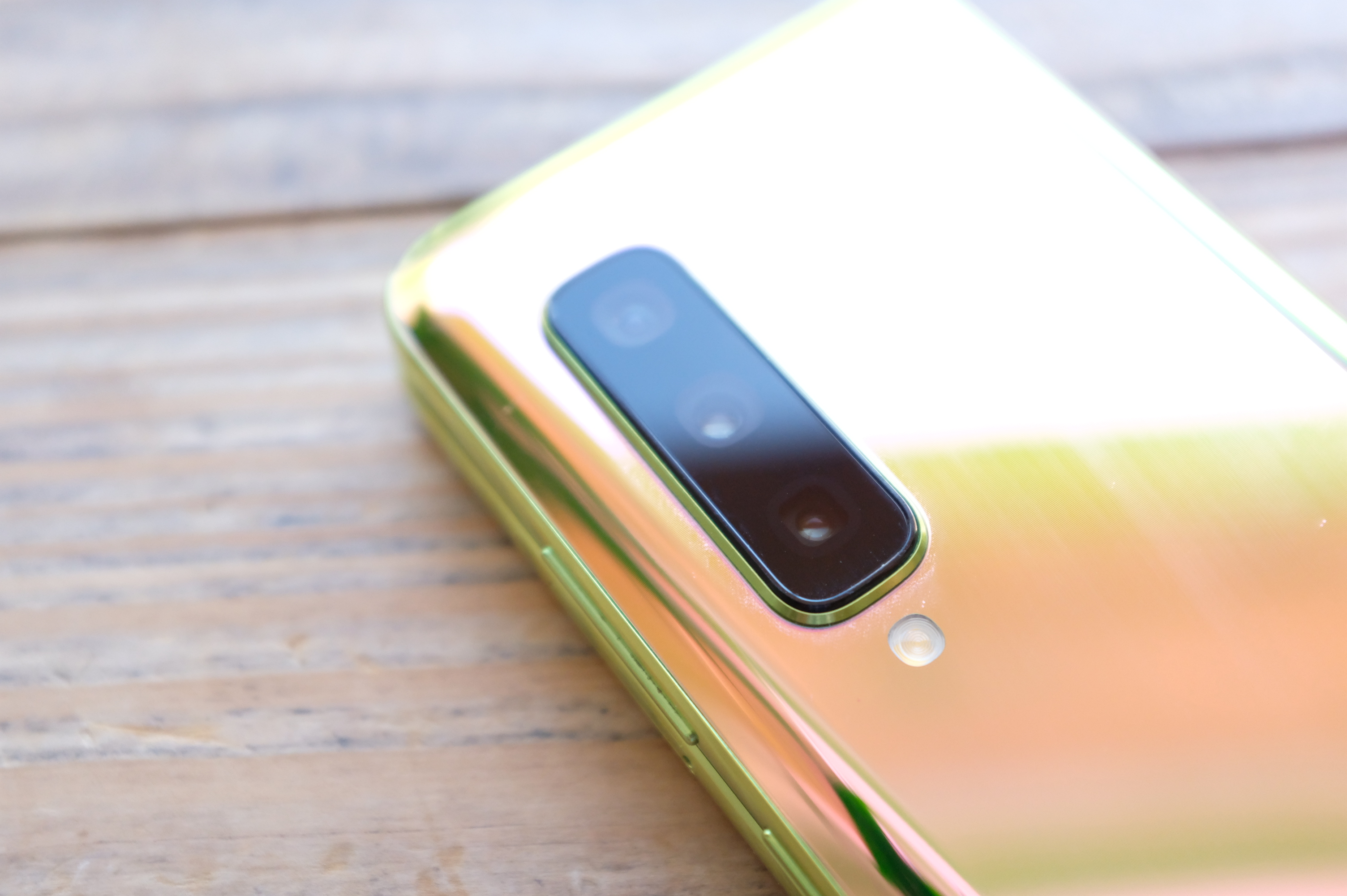
On the rear of the device is a three-camera system that pairs a beefy 48-megapixel lens with a 78mm telephoto and 117-degree ultra-wide angle. I’ve had some opportunity to play with the phone, and this really does seem to be the most utilitarian set up for a three-camera system, and the camera software does a nice job transitioning between lenses as you zoom in.
This is a premium device inside, as well. The Snapdragon 855 is coupled with 6-12GB of RAM and either 128 or 256GB of storage. The battery is a beefy 4,000 mAh, which will get you through more than a day on a single charge, no problem. The “Warp Charge” maintains the company’s fast-charging tradition, letting you fill up around half the battery in 20 minutes using the included adapter.
OnePlus has really outdone itself here, once again proving that a truly premium device doesn’t require a four-digit investment. Other companies have explored a similar price point with varying degrees of success. For OnePlus fans not ready to take the step up, the company will continue to provide a more more affordable line going forward. For now, however, the 7 Pro is easily one of the best ways to get a truly premium smartphone experience without paying an arm and leg.
The 7 Pro will be available online May 17 through OnePlus’ site and T-Mobile.
Powered by WPeMatico

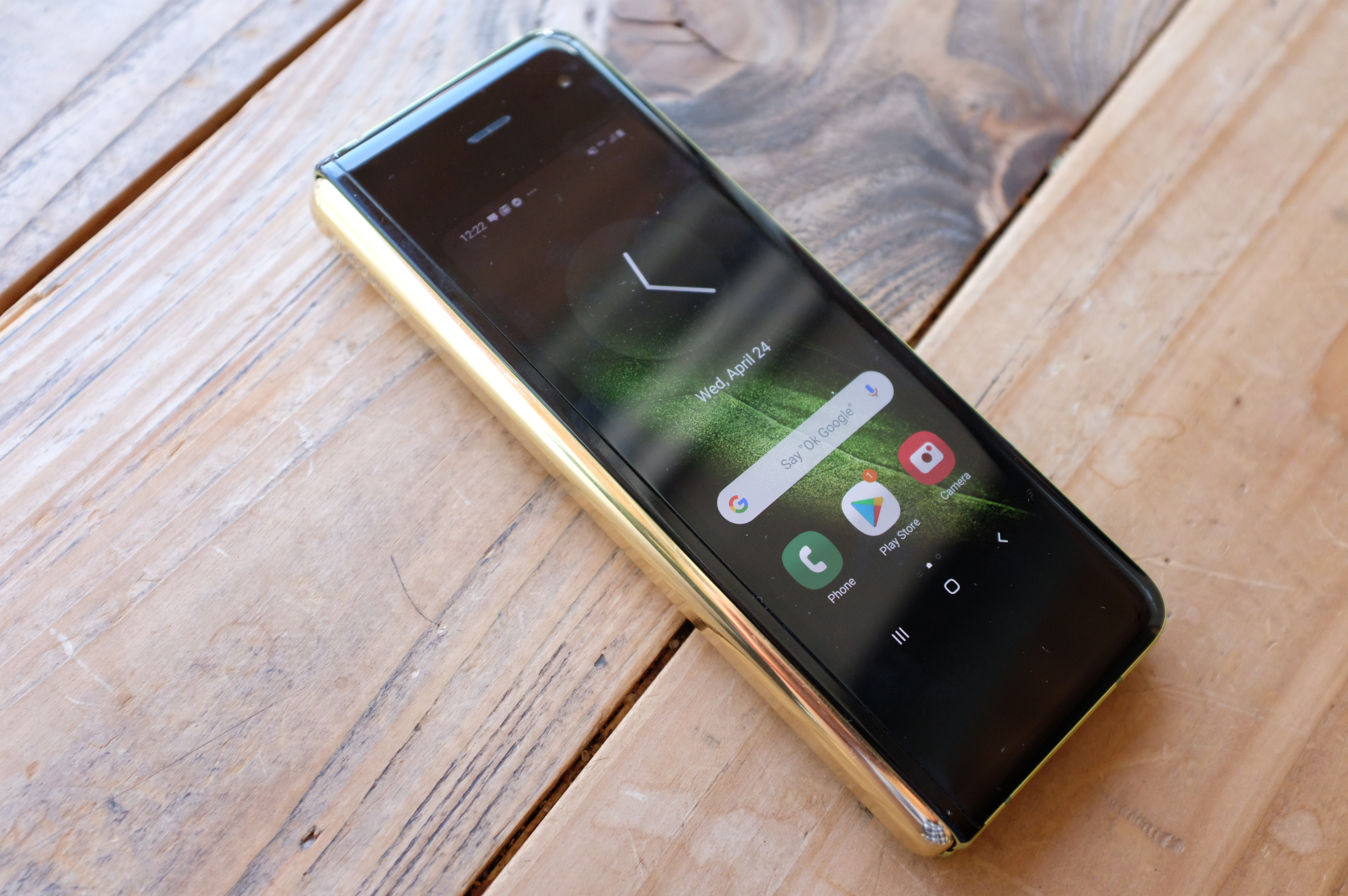
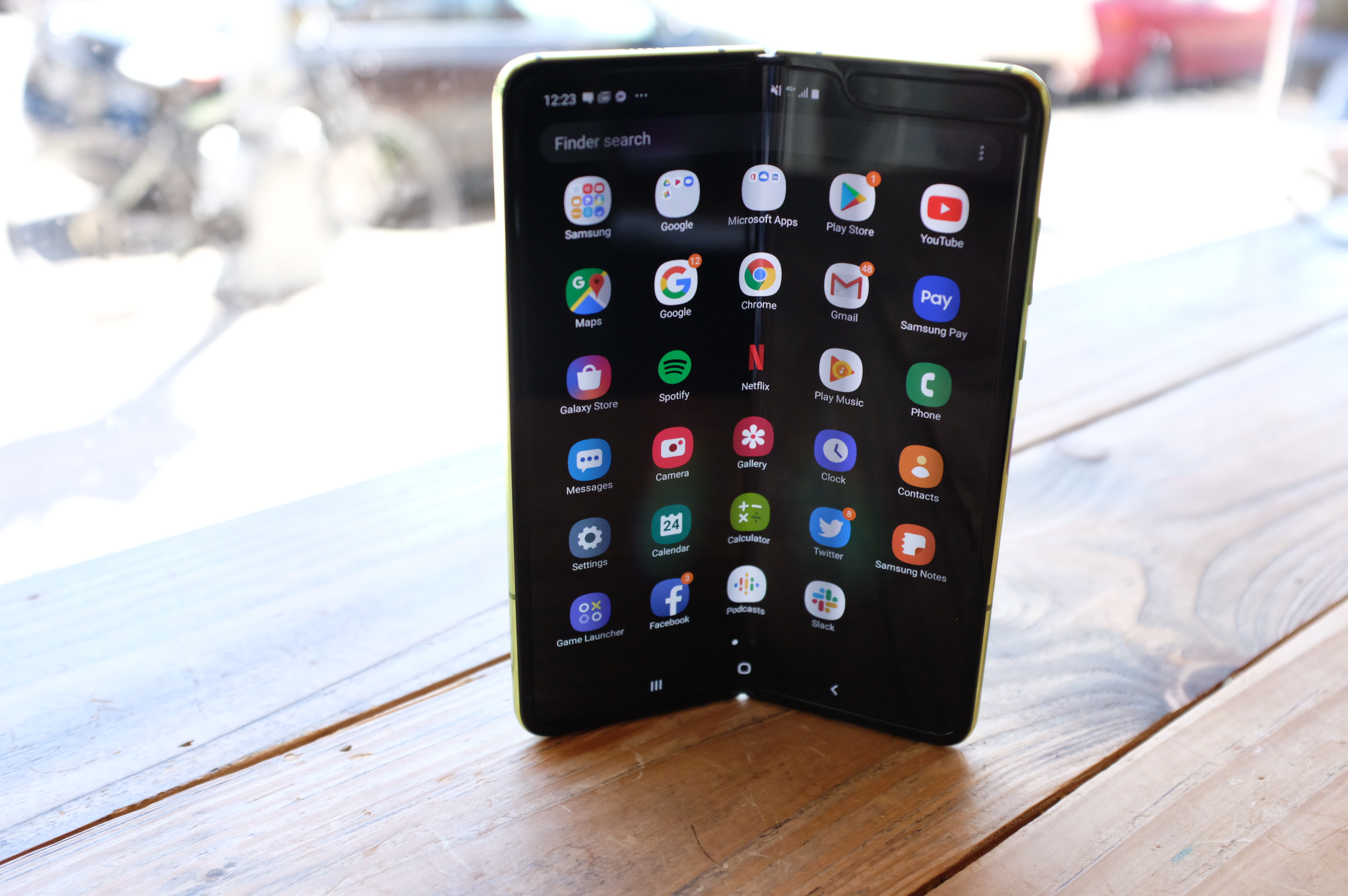
The Galaxy Fold has been the most polarizing product I can recall having reviewed. Everyone who saw it wanted to play with the long-promised smartphone paradigm shift. The results, on the other hand, were far more mixed.
If nothing else, the Fold has a remarkably high Q-Rating. Each person who saw me using the product had at least a vague idea of what it was all about. I honestly can’t remember the last time I’ve had that reaction with a non-iPhone device. That’s great from brand perspective. It means a lot of people are curious and potentially open to the notion that the Samsung Galaxy Fold is the future.
Of course, it also means there are a lot of people looking on if you fail.
In some ways, this past week with the Samsung Galaxy Fold has been an extremely public beta. A handful of samples were given out to reviewers. Most worked fine (mine included), but at least three failed. It’s what we in the industry call a “PR nightmare.” Or at least it would be for most companies.
Samsung’s weathered larger storms — most notably with the Galaxy Note 7 a few years back. Of course, that device made it much further along, ultimately resulting in two large-scale recalls. The nature of the two issues was also vastly different. A malfunctioning screen doesn’t put the user at bodily risk like an exploding battery. The optics on these things don’t get much worse than having your smartphone banned from planes.
As of this writing, the Fold is still set to go on sale, most likely this year. To be perfectly frank, the April 26 release date seemed overly optimistic well before the first reports of malfunctioning units. It’s never a great sign when a device is announced in February and is only made available for review a few weeks ahead of launch. It’s kind of like when a studio doesn’t let reviewers watch a film before release. It doesn’t necessarily mean it’s bad, but it’s something to keep an eye on.
That’s the thing. The Galaxy Fold is the kind of device you want badly to succeed. You want it to be great and you want Samsung to sell a billion because it’s a genuinely exciting product after a decade of phones that look mostly the same. There’s also the fact that Samsung has essentially been hyping this thing for eight years, since it debuted a flexible display at CES 2011.
In spite of that, however, the home stretch feels rushed. Samsung no doubt saw the writing on the wall, as companies like Huawei readied their own foldable. And while Royole beat the fold to market, Samsung still had a very good shot at the claim of first commercially viable foldable on the market, with a decade of Galaxy devices under its belt and hand-in-hand work with the Google team to create an Android UX that makes sense on a pair of very different screens.
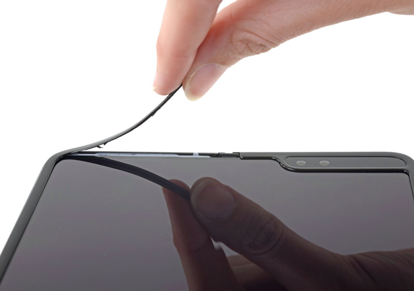
[Source: iFixit]
But this iFixit teardown speaks volumes. “Alarmingly” isn’t the kind of word you want/expect to hear about a company like Samsung, but there it is, followed directly by “fragile” — itself repeated five times over the course of the write-up. iFixit’s findings match up pretty closely with Samsung’s own reports:
What makes all of this doubly unfortunate is that Samsung has about as much experience as anyone making a rugged phone that works. I feel confident that the company will do just that in future generations, but unless the company can come back with definitive evidence that it’s overhauled the product ahead of launch, this is a difficult product to recommend.
Samsung knew the first-gen Galaxy Fold would be a hard sell, of course. The company was pretty transparent about the fact that the experimental form factor, coupled with the $1,980 price tag, meant the device will only appeal to a small segment of early adopters.
Even so, the company managed to sell out of preorders — though it didn’t say how large that initial run was. Nor are we sure how many users have canceled in the wake of this past week’s events. Certainly no one would blame them for doing so at this point.
But while the apocalyptic shit-posters among us will declare the death of the foldable before it was ever truly born, whatever doesn’t kill Samsung has only made it stronger. And this misfire could ultimately do that for both the company and the category, courtesy of its informal beta testing.
Rewind a mere week or so ago (seriously, it’s only been that long), when we finally got our hands on the Galaxy Fold. I was impressed. And I certainly wasn’t alone. Admittedly, there’s a bit of a glow that first time you see a device that’s seemingly been teased forever. The fact that it exists feels like a kind of victory in and of itself. But the Fold does an admirable job marrying Samsung’s hardware expertise with a new form factor. And more importantly, it’s real and works as advertised — well, mostly, at least.
The truth is, I’ve mostly enjoyed my time with the Galaxy Fold. And indeed, it’s been fun chronicling it on a (nearly) daily basis. There are some things the form factor is great for — like looking at Google Maps or propping it up to watch YouTube videos on the elliptical machine at the gym. There are others when the bulky form factor left me wanting to go back to my regular old smartphone — but those trade-offs are to be expected.
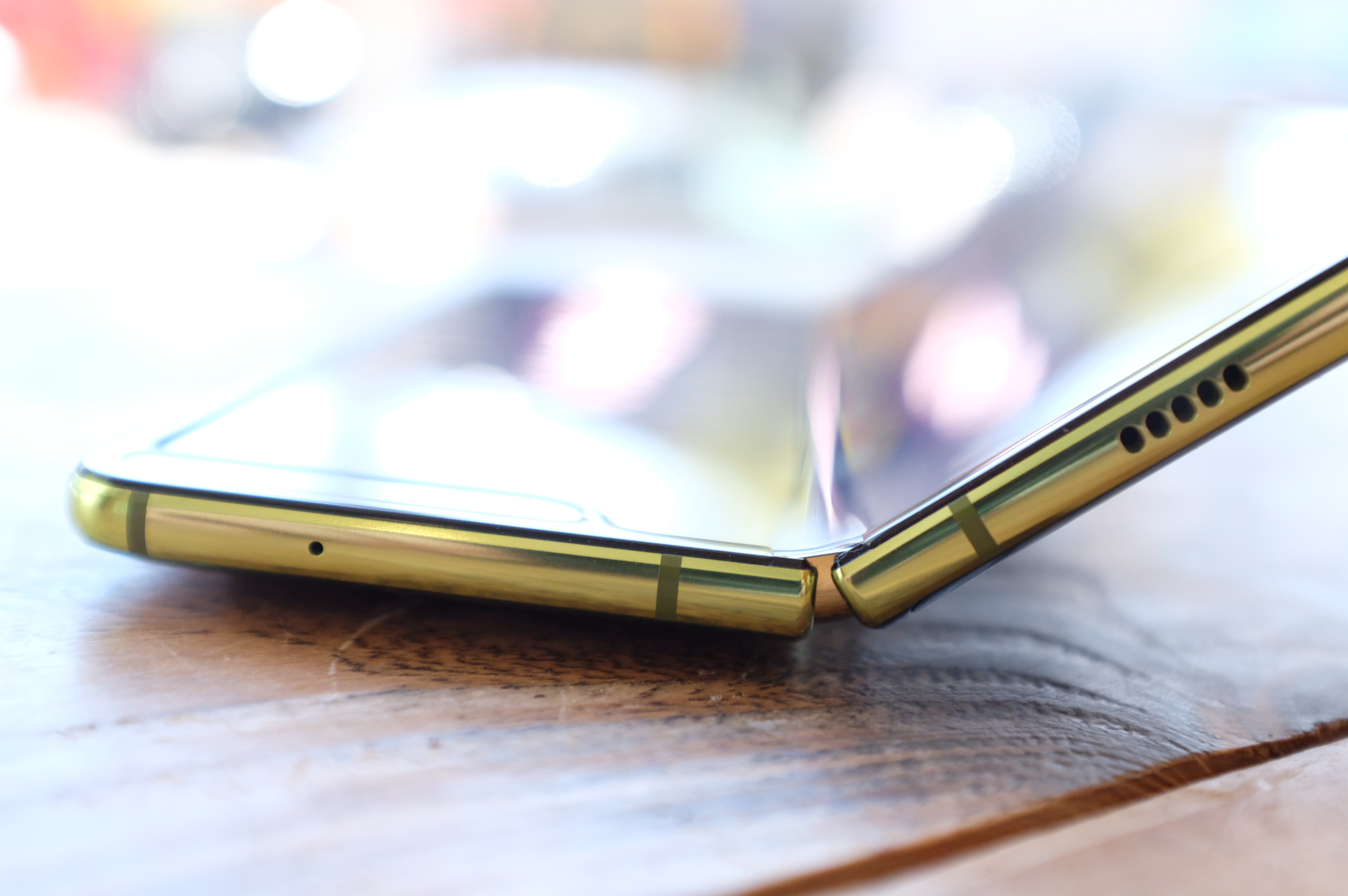
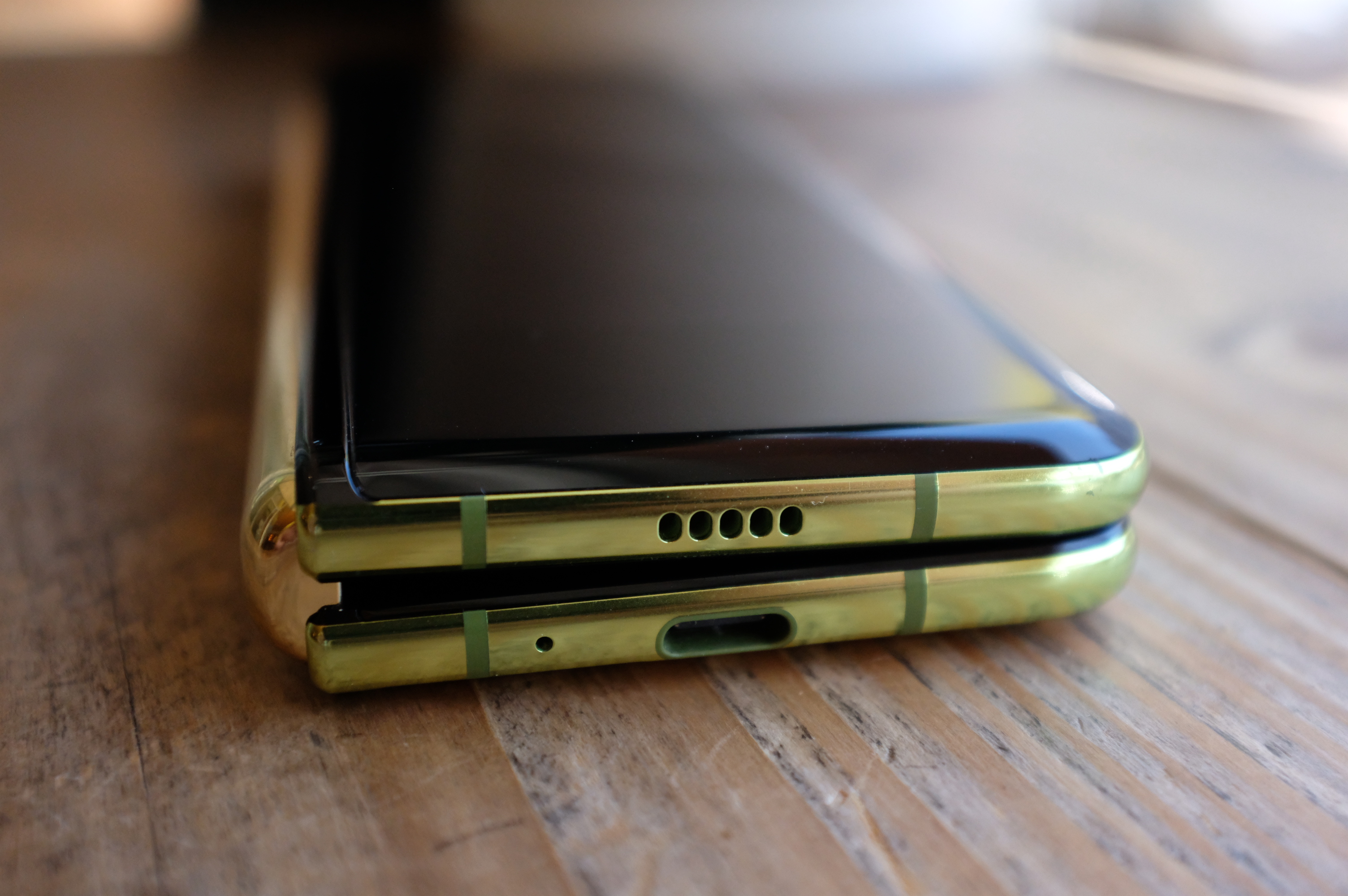
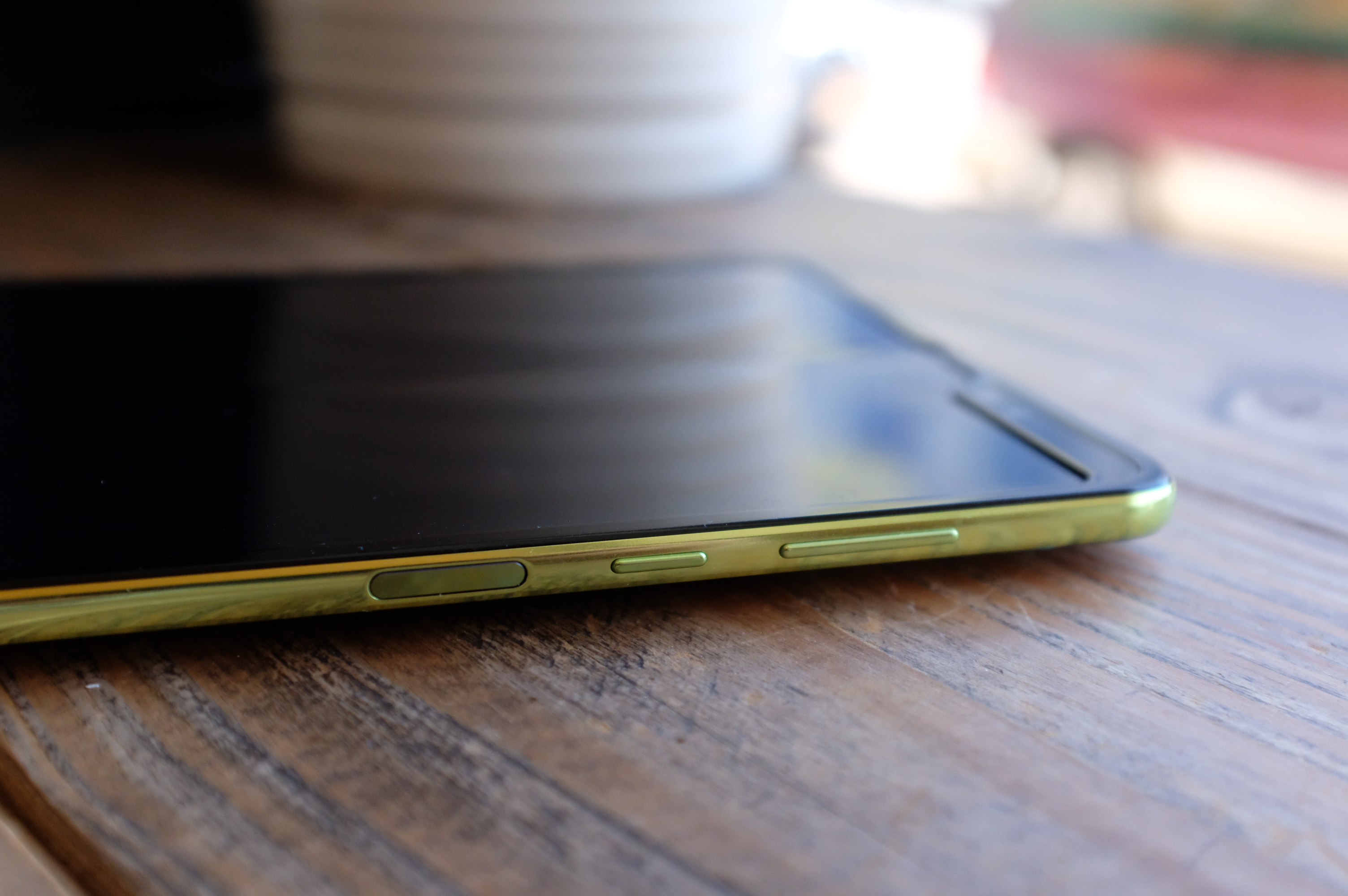
I both like the Fold’s design and understand the criticism. Samsung’s done a good job maintaining the Galaxy line’s iconic design language. The foldable looks right at home alongside the S and Note. That said, the rounded backing adds some bulk to the product. And while open, the device is thinner than an iPhone, when folded, it’s more than double the thickness, owing to a gap between the displays. It’s quite skinny in this mode, however, so it should slip nicely into all but the tightest pants pockets.
In practice, the folding mechanism might be the most impressive part of the product. The inside features several interlocking gears that allow the product to open and shut with ease and let users interact with the device at various states of unfold. I found myself using the device with it open at a 90-degree angle quite a bit, resting in my hand like an open book. The Fold features a pair of magnets on its edges, which let you close it with a satisfying snap. It’s weirdly therapeutic.
Really, the biggest strike against the device from a purely aesthetic standpoint is that it’s not the Mate X. Announced by Huawei a few days after the Fold’s big unveil, the device takes a decidedly more minimalist approach to the category. It’s an elegant design that features less device and more screen, and, honestly, the kind of thing I don’t think most of us expected until at least the second-generation product.
The gulf between the two devices is especially apparent when it comes to the front screen. The front of the screen is around two-fifths bezel, leaving room for a 4.6-inch display with an awkward aspect ratio. The Mate X, meanwhile, features a 6.6-inch front-facing AND 6.4-inch rear-facing display (not to mention the larger eight-inch internal display to the Fold’s 7.3).
There’s reason to recommend the Fold over the Mate X, as well. I can’t speak to the difference in user experience, having only briefly interacted with the Huawei, but the price point is a biggie. The Mate X starts at an even more absurd $2,600, thanks in part to the fact that it will only be available in a 5G version, adding another layer of niche.
That price, mind you, is converted from euros, because 1) The product was announced at MWC in Barcelona and 2) U.S. availability is likely to be a nonstarter again, as the company continues to struggle with U.S. regulators.
Of course, the Fold’s U.S. availability is also in limbo at the moment, albeit for very different reasons.
I ultimately spent little time interacting with the front screen. It’s good for checking notifications and the like, but attempting to type on that skinny screen is close to impossible, with shades of the new Palm device, which implements its own shortcuts to get around those shortcomings. The inside, meanwhile, takes a butterfly keyboard approach, so you can type with both thumbs while holding it open like a book.
There’s also the issue of app optimization. A lot of this can be chalked up to an early version of a first-gen device. But as with every new device, the equation of how much developer time to invest is largely dependent on product adoption. If the Fold and future Fold’s aren’t a success, developers are going to be far less inclined to invest the hours.
This is most painfully obvious when it comes to App Continuity, one of the device’s primary selling points from a software perspective. When working as advertised, it makes a compelling case for the dual screens. Open something on the front and expand your canvas by unfolding the device. Google is among the companies that worked directly with Samsung to optimize apps this way, and it’s particularly handy with Maps. I used it a fair amount on my trip last week to Berkeley (shout out to the fine people at Pegasus Books on Shattuck).
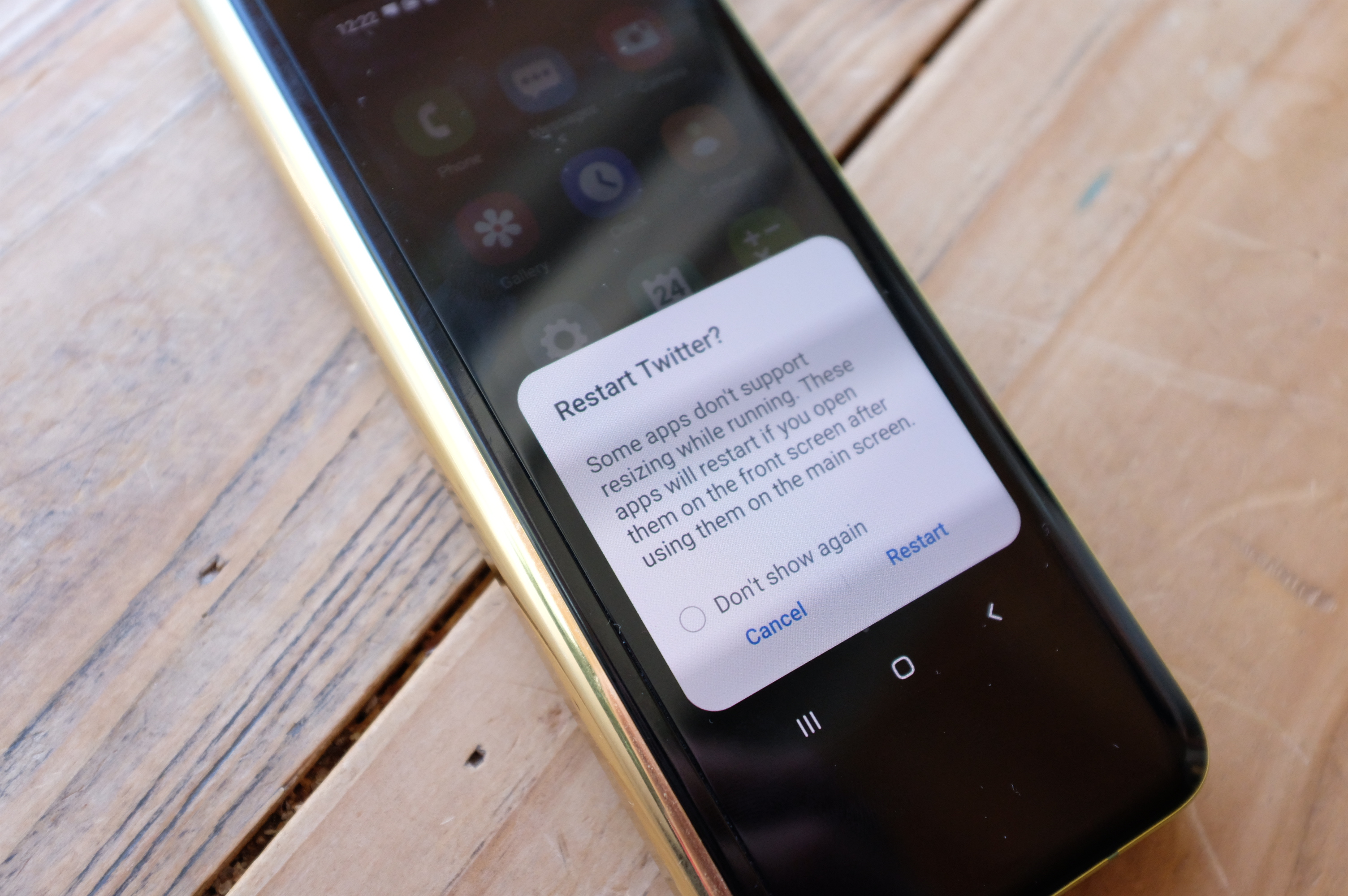
When an app isn’t optimized, Samsung compels you to restart it, or else you get a nasty case of letterbox bars that retain the aspect ratio of the front screen. Continuity isn’t designed to work the other way, either — opening something on the large screen and then transferring to the front. That’s a bit trickier, as shutting the phone is designed to offer a kind of finality to that session, like hitting the power button to put the device to sleep.
I get that, and like many other pieces here, it will be interesting to see how people utilize it. Aside from the obvious hardware concerns, much of the work on the second-generation device will center around learnings from how users interact with this model. I know I surprised myself when I ended up using the 7.3-inch screen to snap photos. It felt silly — like those people who bring iPads to photograph events. But it’s ultimately a much better viewfinder than that measly 4.6-incher.
That’s really just the tip of the iceberg for the inside screen, of course. The size, which is somewhere between phablet and mini tablet, provides ample real estate that can still be held in one hand. It’s a great size for short videos. I’ve watched a lot of YouTube on this thing, though the speakers (a small series of holes on the upper and lower edges) leave a lot to be desired.
And the seam. I found myself uttering the phrase “it could be worse” a lot. Like so much of the general aesthetic (including the odd green-gold color of my Fold’s casing), it’s lighting-dependent. There are plenty of times when you don’t see it all, and other when the glare hits it and makes it look like a line right down the center.
I realized after snapping a couple of photos that it’s particularly apparent in many shots. That probably gives a false impression of its prominence. It sucks that there’s one at all, but it’s not a surprise, given the nature of the design. You mostly don’t notice it, until your finger swipes across it. And even then it’s subtle and totally not a dealbreaker, unlike, say, the massive gap that made the ZTE Axon M look like two phones pasted together.
I love the ability to stand the device up by having it open at a 90-degree angle, so I can watch videos while brushing my teeth. But this orientation blocks the bottom speakers, hampering the already iffy sound. Thankfully, your $1,980 will get you a pair of the excellent Galaxy Buds in box. It’s hard to imagine Apple bundling AirPods with the next iPhone, but I guess stranger things have happened, right?
Multi-Active Window is the other key software piece. It’s something that has been available on other Samsung devices and certainly makes sense here. Open an app, swipe left from the right side of the screen and a tray will open. From there, you can open up to three apps on the display. Once open, the windows feature a small tab at the top that lets you rearrange them.
It’s handy. I used it the most during those times I had a video playing on an exercise machine, so I didn’t have to close out of everything to check emails and Twitter. I’m a gym multi-tasker. I’m sorry, it’s just who I am now.
It worked quite well on the whole, courtesy of robust internals, including 12GB of RAM and a Snapdragon 855. The primary issue I ran into was how some of the apps maintained that half-screen format after I closed out and reopened. I’m sure some people will prefer that, and I’m honestly not sure what the ideal solution is there.
The Fold’s also got a beefy battery on board. Like Huawei’s, it’s split in two — one on either side of the fold. They work out to a beefy 4,380 mAh. That’s just slightly less than Huawei’s 4,500, but again, the Mate X is 5G by default — which means it’s going to burn through mAhs at a faster rate.
Ultimately, the Fold’s greatest strength is Samsung itself. I understand why you probably just did a double take there in the wake of the company’s latest hardware scandal, but the fact is that the company knows how to build phones. The Fold was very much built atop the foundation of the successful Galaxy line, even while it presents a curious little fork in the family tree.
That means a solid and well-thought-out user experience outside of the whole fold thing.
That list includes great cameras with excellent software features and clever tricks like the new Wireless PowerShare, which lets you fold up the phone and charge up those Galaxy Buds or another phone while it’s plugged in. For better or worse, it also includes Bixby. Our model was a European version that didn’t have the full version, but I think I’ve made my thoughts on the smart assistant pretty well known over the last couple of years.
The devoted Bixby button is very much here. And yes, I very much accidentally pressed it a whole bunch. The headphone jack, on the other hand, is conspicuously absent, which is no doubt a big driver behind the decision to include Galaxy Buds. The Fold is an anomaly in a number of ways, but it’s hard to shake the feeling that this might finally represent the beginning of the end for the port on Samsung’s premium devices.
Also absent is the S Pen. The stylus began life on the Note line and has since branched out to other Samsung devices. I suspect the company would have had a tough time squeezing in space for it alongside the dual batteries, and maybe it’s saving something for future generations, but this does feel like the ideal screen size for that accessory.
I’m parting ways with the Fold this week, per Samsung’s instructions. Unlike other products, giving it up won’t feel that tough. There wasn’t a point in the past week when the Fold didn’t feel like overkill. There were, however, times when my iPhone XS screen felt downright tiny after switching back.
In many ways, the foldable phone still feels like the future, and the Fold feels like a stop along the way. There are a lot of first-gen issues that should be/should have been hammered out before mass producing this device. That said, there are certain aspects that can only really be figured out in real-world testing. Take the fact that Samsung subjected the device to 200,000 mechanical open and closes. That’s a lot, and probably more than the life of just about any of these devices, but people don’t open and close like machines. And when it comes to the screen, well, a little dirt is bound to get between the gears, both metaphorically and literally.
As I close this Galaxy Fold a final time, it seems safe to say that the device represents a potentially exciting future for a stagnant smartphone space. But that’s the thing about the future — it’s just not here yet.
Powered by WPeMatico

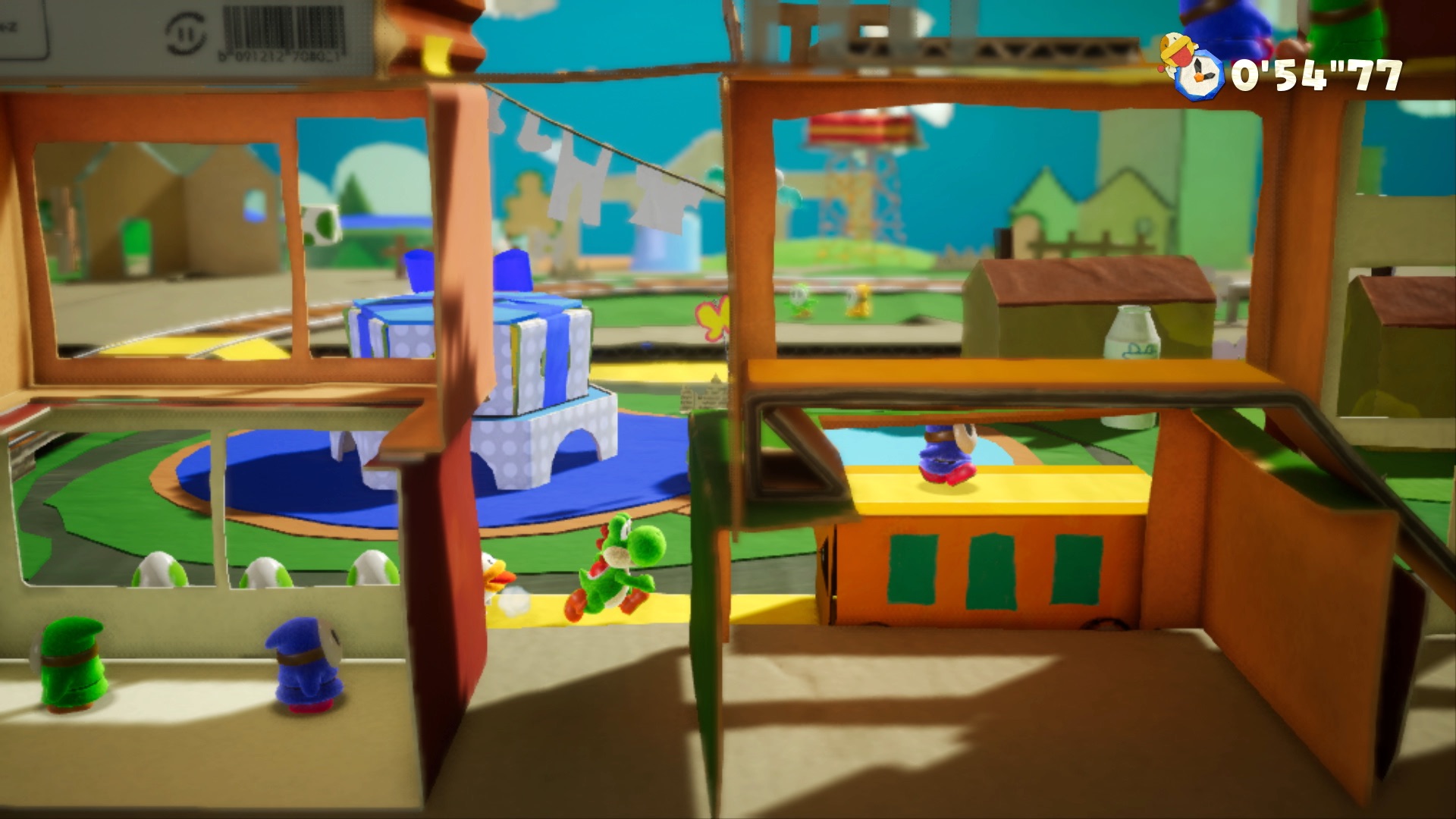
In 1995, Yoshi had his moment. The character’s Super Mario World debut was so strong, Nintendo handed the dinosaur sidekick his own sequel. A surprise divergence from the Mario franchise found the character escorting a baby version of the plumber in search of his kidnapped twin.
Super Mario World 2: Yoshi’s Island was regarded as an instant classic for the Super Nintendo. The positive reaction was due, in part, to some bold aesthetic choices. The game featured a shaky line style, both in keeping with the playful infant motif and to further highlight that the title wasn’t just another Mario game.
Yoshi’s island has received a number of its own sequels and spinoffs over the years. This is, after all, Nintendo we’re talking about here. The company has turned riding out IP into a kind of art form. But while many of those followups were generally well-received, but none managed to capture the pure joy of the original.
2015’s Yoshi’s Wooly World came close, but ultimately failed to meet the high standards of many Mario fans. And the fact that the Wii U was ultimately a doomed console didn’t help matters much.
From a design perspective, Yoshi’s Crafted World clearly shares a lot of common DNA with that predecessor and, for that matter, Kirby’s Epic Yarn, with developer Good-Feel being a common denominator in all three. But the Switch title is a far more fully realized and cohesive package than the Wii U title. And like Yoshi’s Island before it, it’s a joy to play.
The first time I saw gameplay footage, I’d assume the game was a bit more of an open-world adventure — the Yoshi’s Island to Super Mario Galaxy’s Super Mario World. But while the new title gives you some choices, it never lets you stray too far from the standard platformer path.
To this day, side scrollers continue to be Nintendo’s bread and butter, even as it pushes the boundaries of gaming with other titles. At its worst, that means redundancy. At its best, however, Nintendo manages to put a fresh spin on the age old genre, as is the case here.
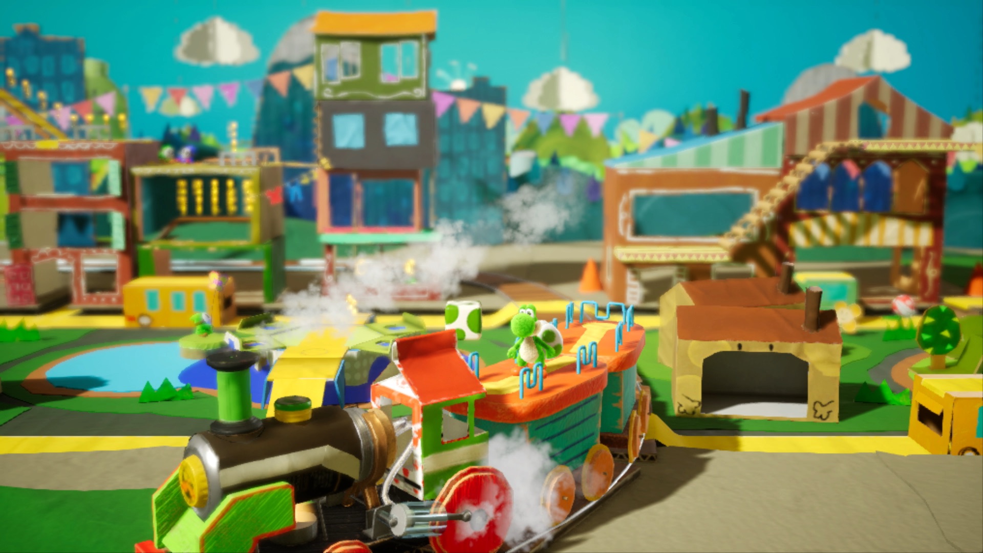
Clever mechanics like 3D world flipping and paths that point Yoshi down roads in a third dimension keep gameplay interesting. The addition of seemingly infinite Mario 3-style cardboard costumes, coupled with the DIY crafted design language, meanwhile, make it downright joy to play.
Yoshi’s Crafted World is an all-ages title, through and through. In fact, on first playing, the game asks whether you want to play “Mellow Mode” or “Classic Mode,” reassuring you that you can switch things up at any time. Even in Classic Mode, the game does a fair bit of handholding.
But the game’s simple and slow pace is more comfort than annoyance for even older players. The title plays like a casual game, writ large with a fun through line that finds Yoshi hunting down scattered “Dream Gems,” like so many Dragon Balls. It’s never as immersive or addicting as a title like Mario Galaxy, but that’s not necessarily a bad thing. It’s the kind of game you can happily play in spurts and come back to, after you’re done living your life.
It’s a reminder that games can be an escape from, rather than cause of, frustration and stress. And it’s definitely the best Yoshi star vehicle in nearly 25 years.
Powered by WPeMatico