The Google Assistant on Android gets more visual responses
About half a year ago, Google gave the Assistant on phones a major visual refresh. Today, the company is following up with a couple of small but welcome tweaks that’ll see the Assistant on Android provide more and better visual responses that are more aligned with what users already expect to see from other Google services.
That means when you ask for events now, for example, the response will look exactly like what you’d see if you tried the same query from your mobile browser. Until now, Google showed a somewhat pared-down version in the Assistant.
Also — and this is going to be a bit of a controversial change — when the Assistant decides that the best answer is simply a list of websites (or when it falls back to those results because it simply doesn’t have any other answer), the Assistant used to show you a couple of boxes in a vertical layout that were not exactly user-friendly. Now, the Assistant will simply show the standard Google Search layout.
Seems like a good idea, so why would that be controversial? Together with the search results, Google will also show its usual Search ads. This marks the first time that Google is showing ads in the Assistant experience. To be fair, the Assistant will only show these kinds of results for a very small number of queries, but users will likely worry that Google will bring more ads to the rest of the Assistant.

Google tells me that advertisers can’t target their ads to Assistant users and won’t get any additional information about them.
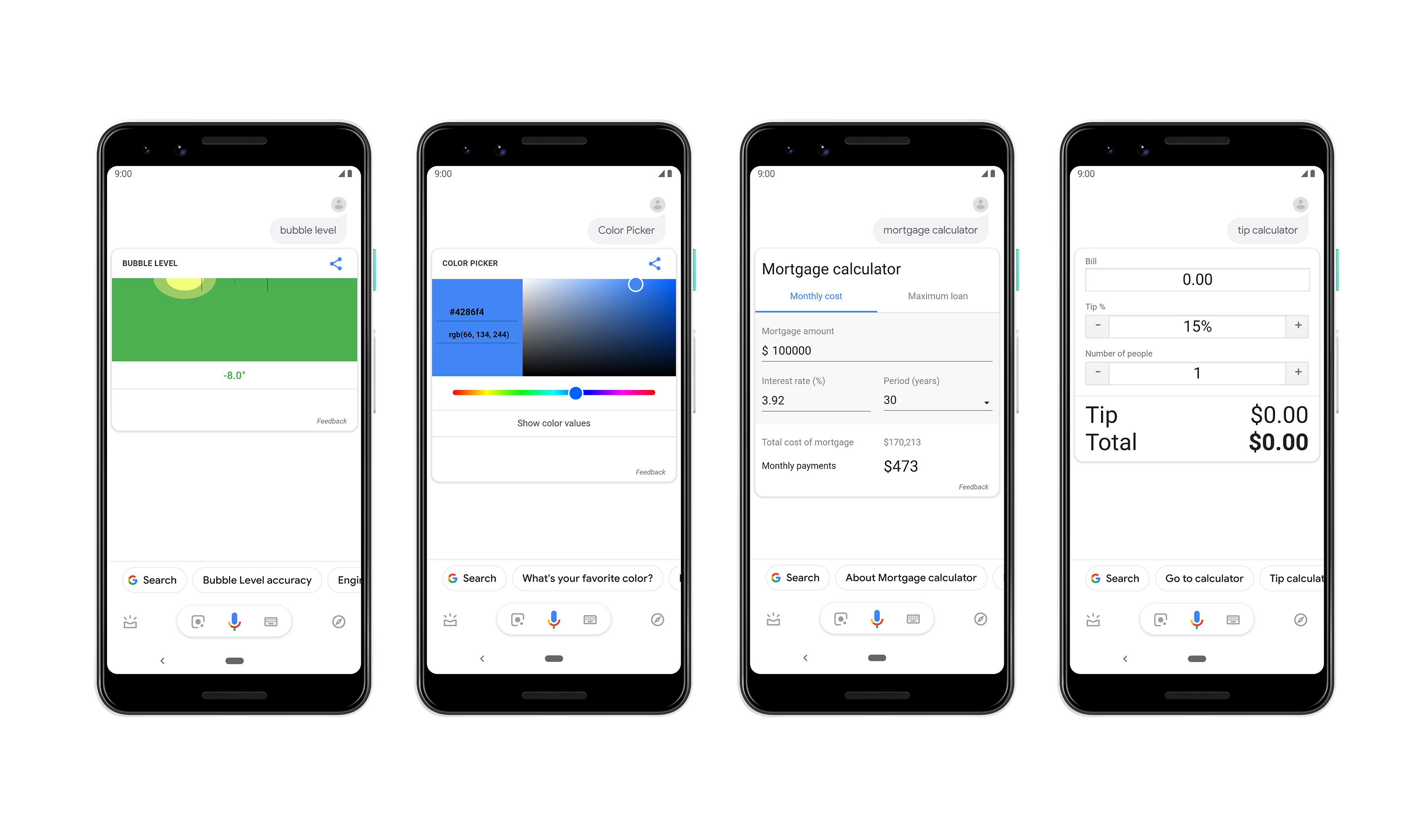
The Assistant will now also show built-in mortgage calculators, color pickers, a tip calculator and a bubble level when you ask for those. Also, when you ask for a stock quote, you’ll now see a full interactive graph, not just the current price of the quote.
These new features are rolling out to Android phones in the U.S. now. As usual, it may take a bit before you see them pop up on your own phone.

Powered by WPeMatico